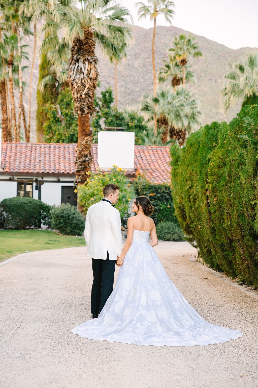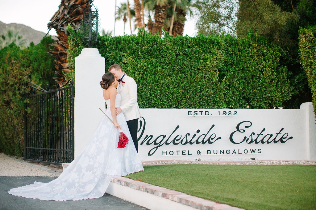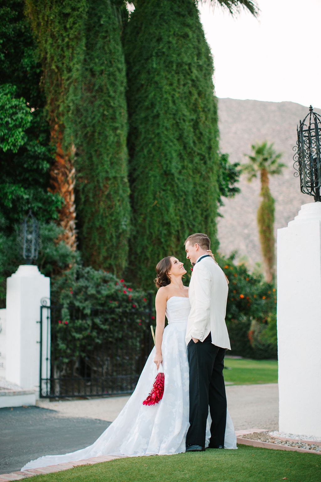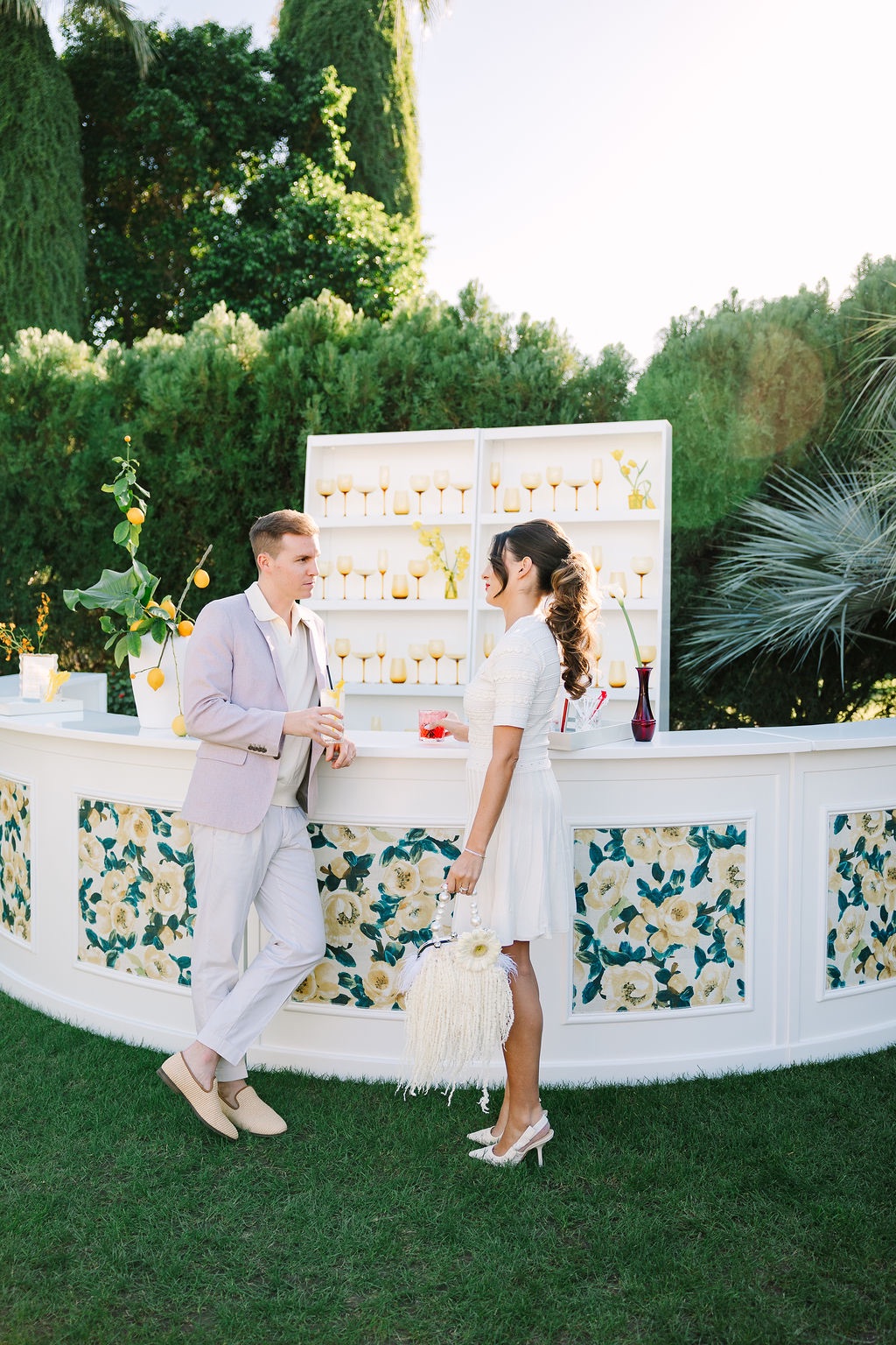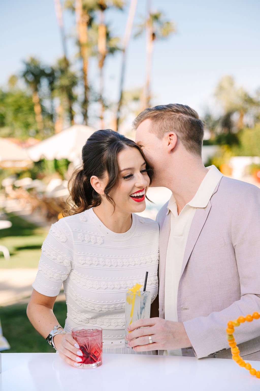
What happens when Cape Cod polish lands in the middle of Palm Springs?
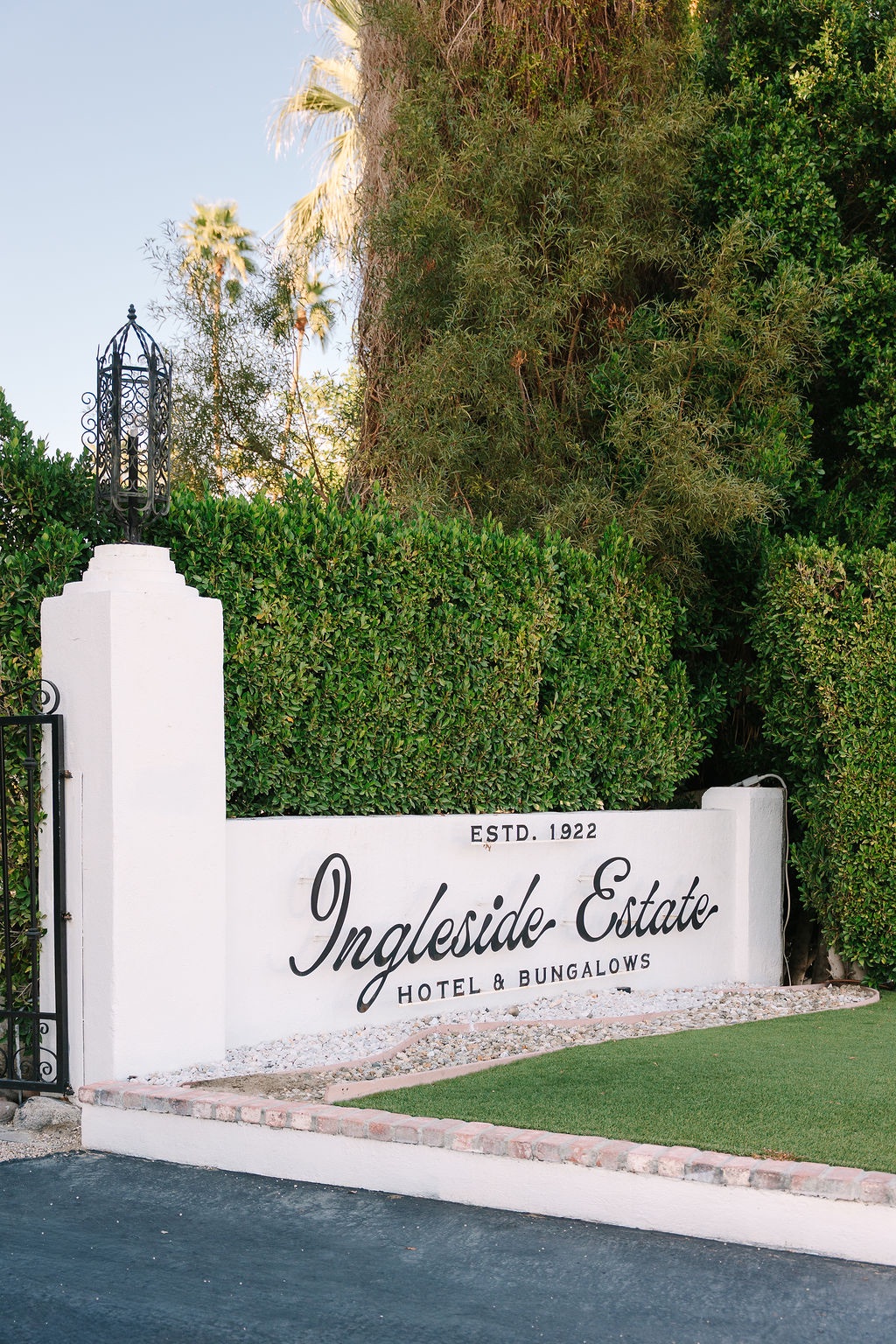
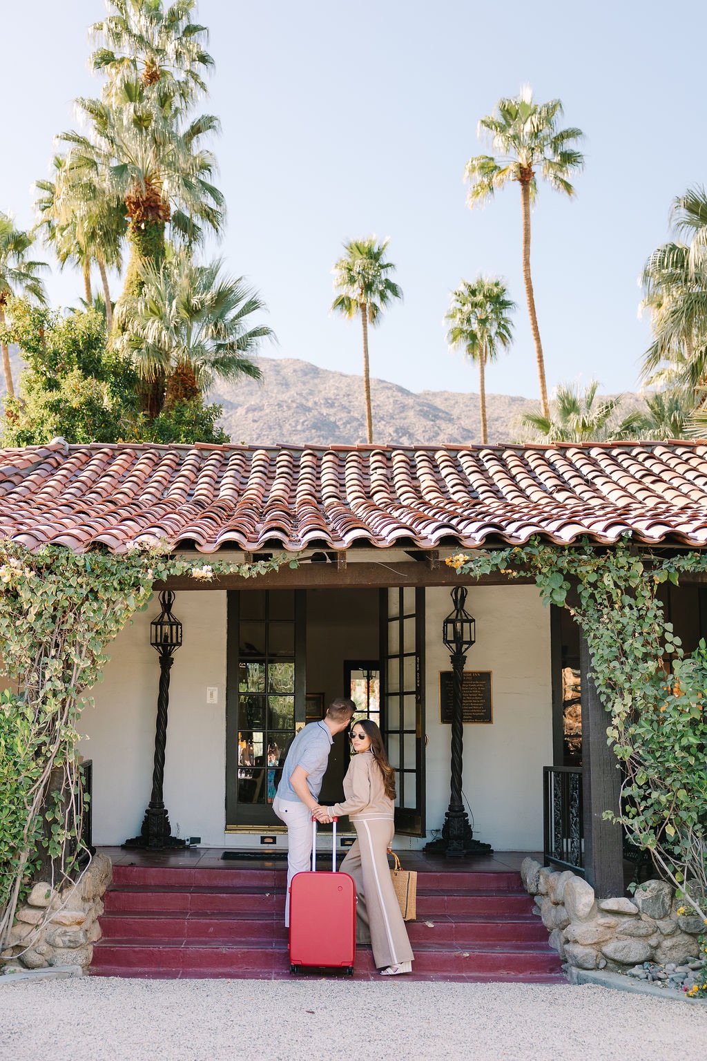
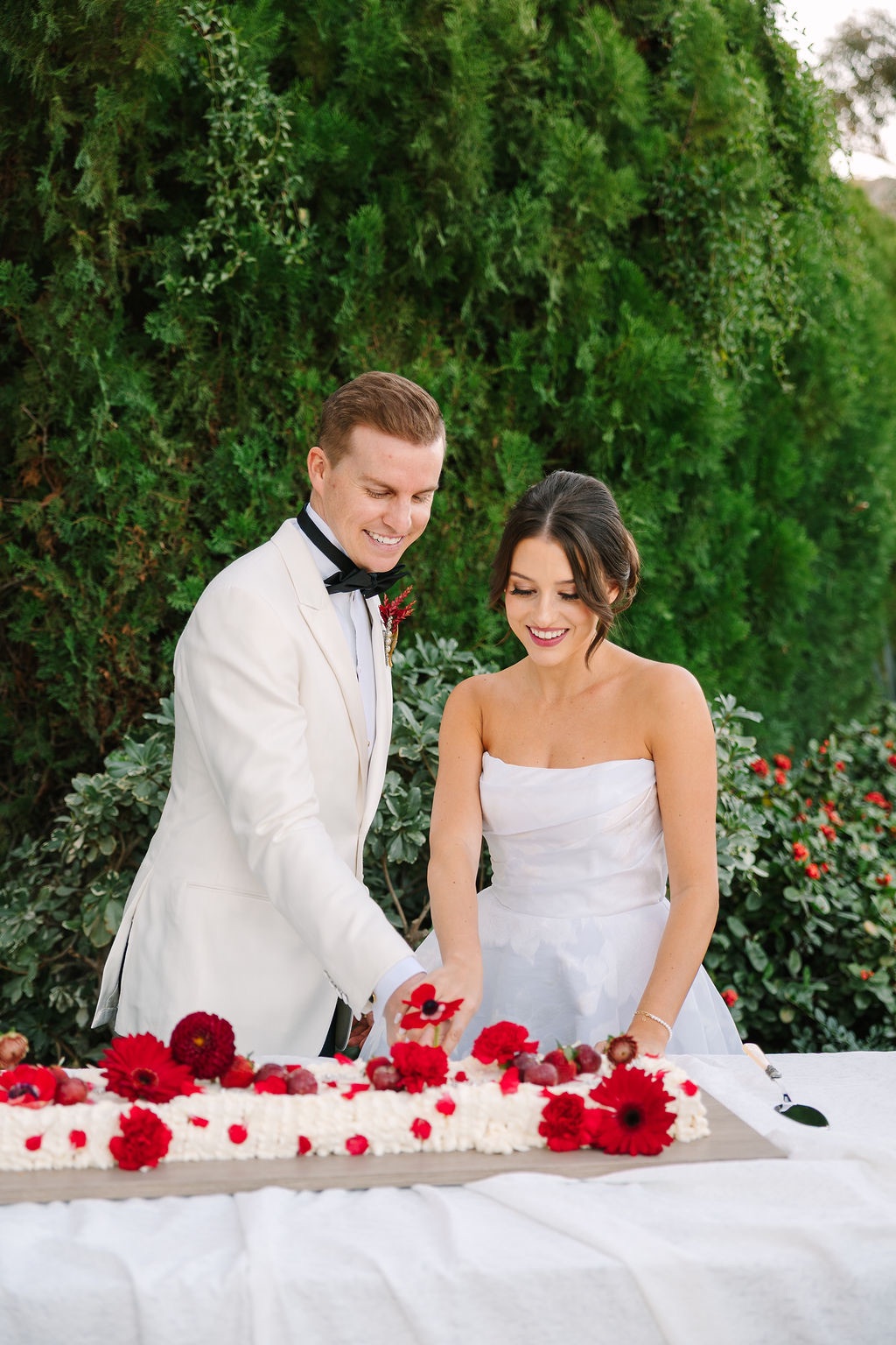
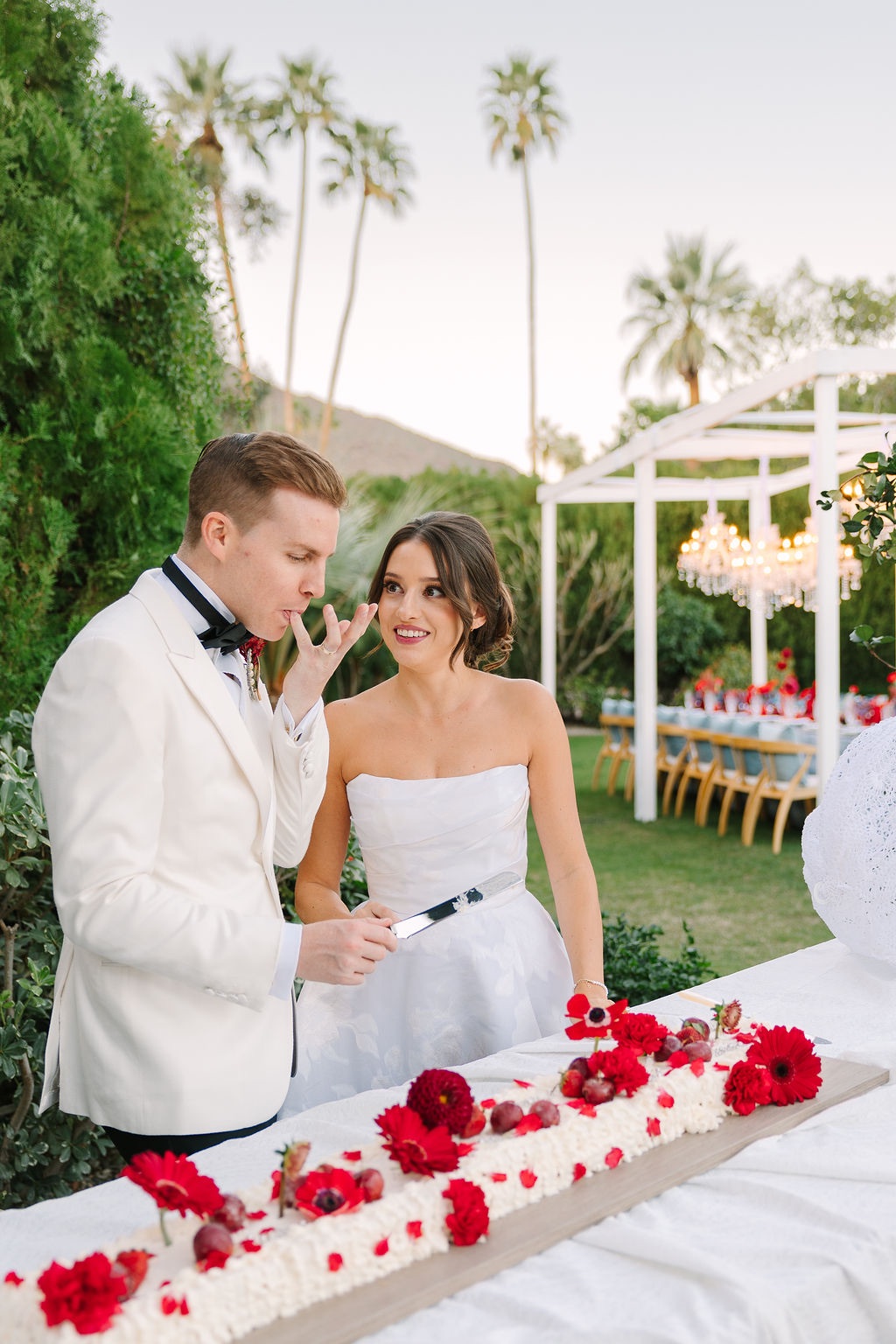
Plaid, Pearls and Palm Springs was designed by Laura J Events as a full wedding weekend experience that brought East Coast tailoring together with the playful energy of retro California. Set at the iconic Ingleside Estate and photographed by Ashley LaPrade Photography, the editorial explored an unexpected premise: traditionally seasonal patterns like plaid can feel completely fresh for spring and early summer when they are paired with the right colors and setting.
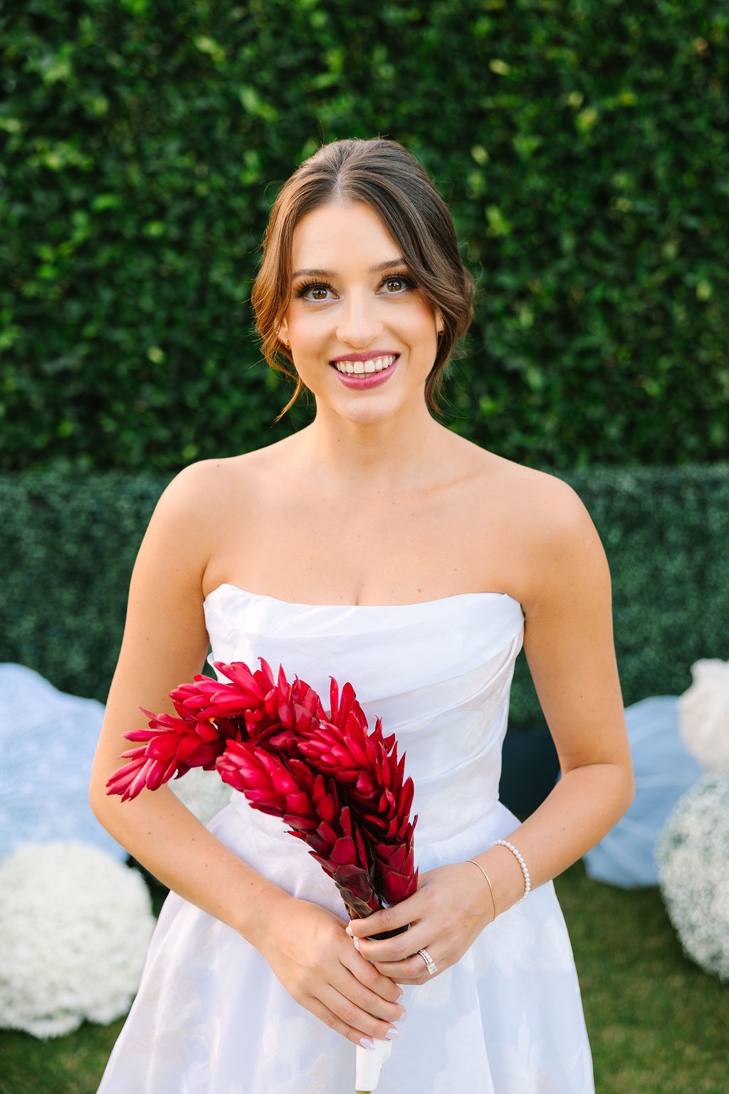
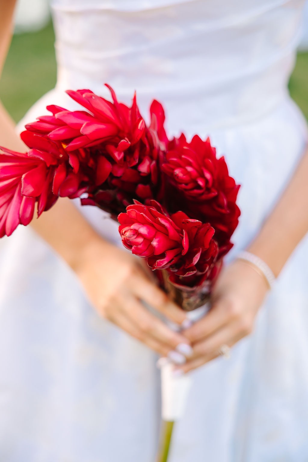
Baby blue provided a softer foundation, while bold red, coral, lemon yellow, and green brought warmth and energy to the palette. Pearls, polished silver, tailored patterns, vintage details, and playful florals carried the story from a champagne-and-oyster arrival through a nostalgic poolside welcome party and into a more refined ceremony and reception.
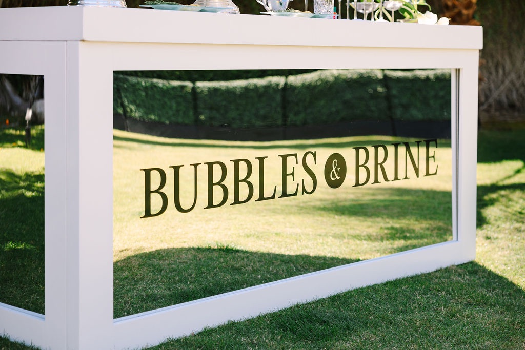
“Bubble & Brine” welcomed guests to Palm Springs
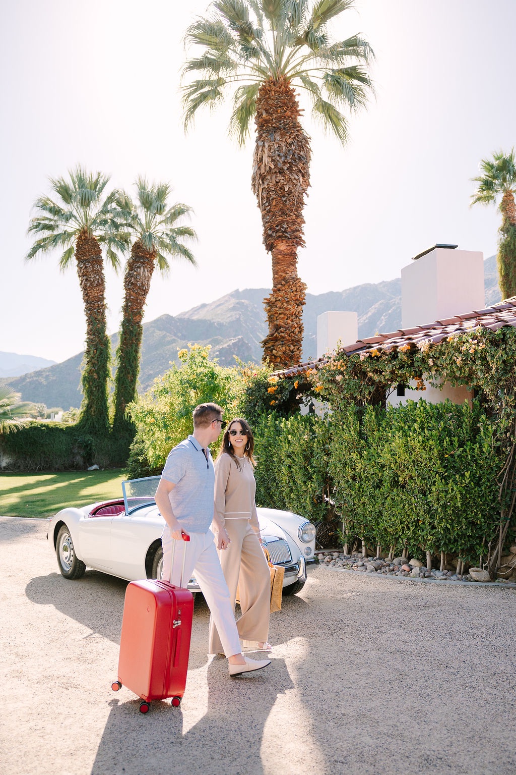
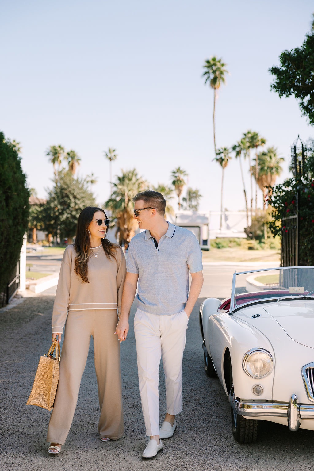
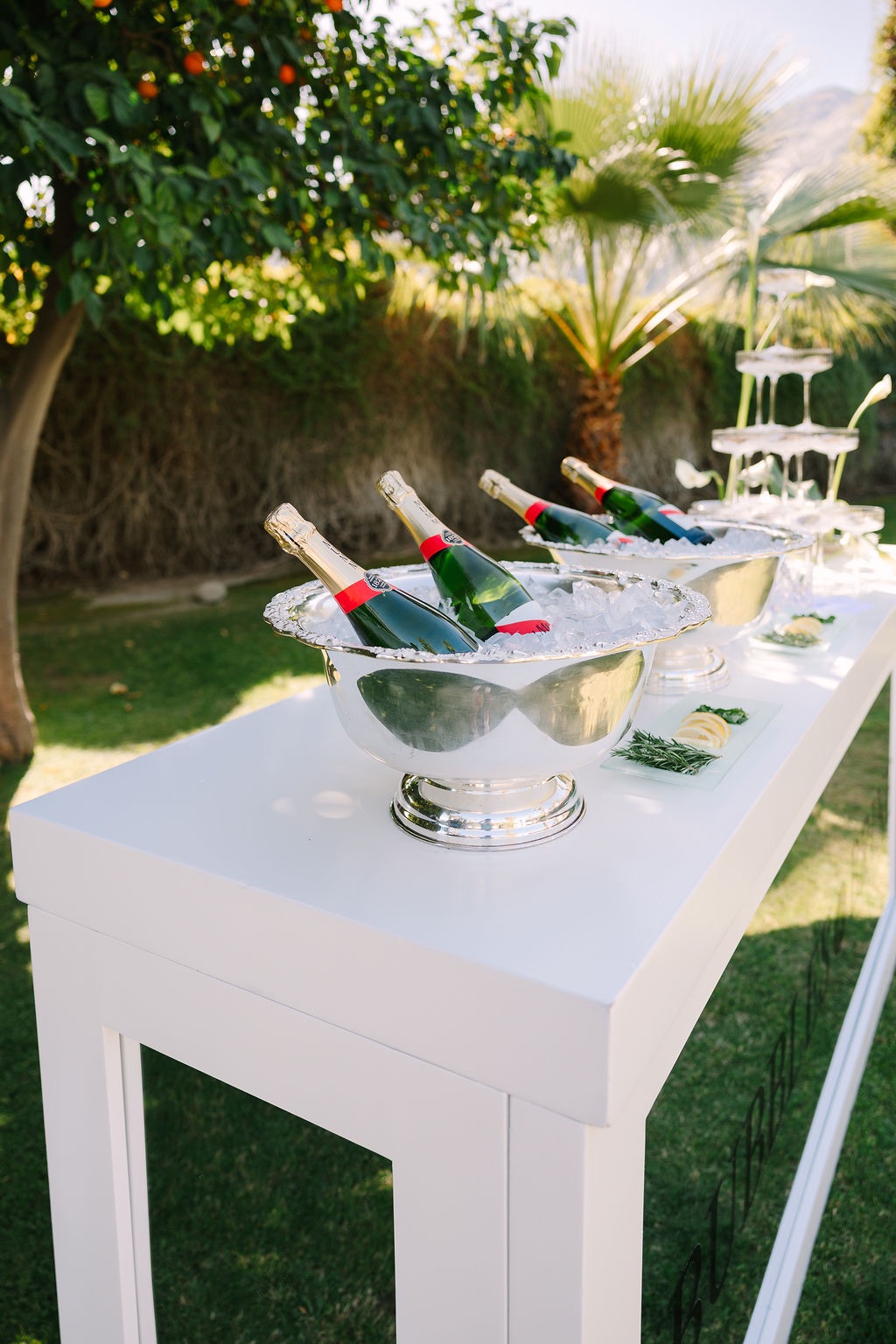
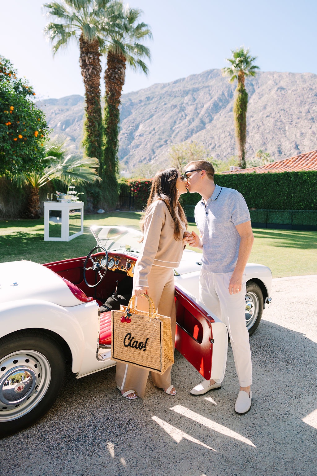
The imagined wedding weekend began with an arrival experience appropriately named “Bubble & Brine.”
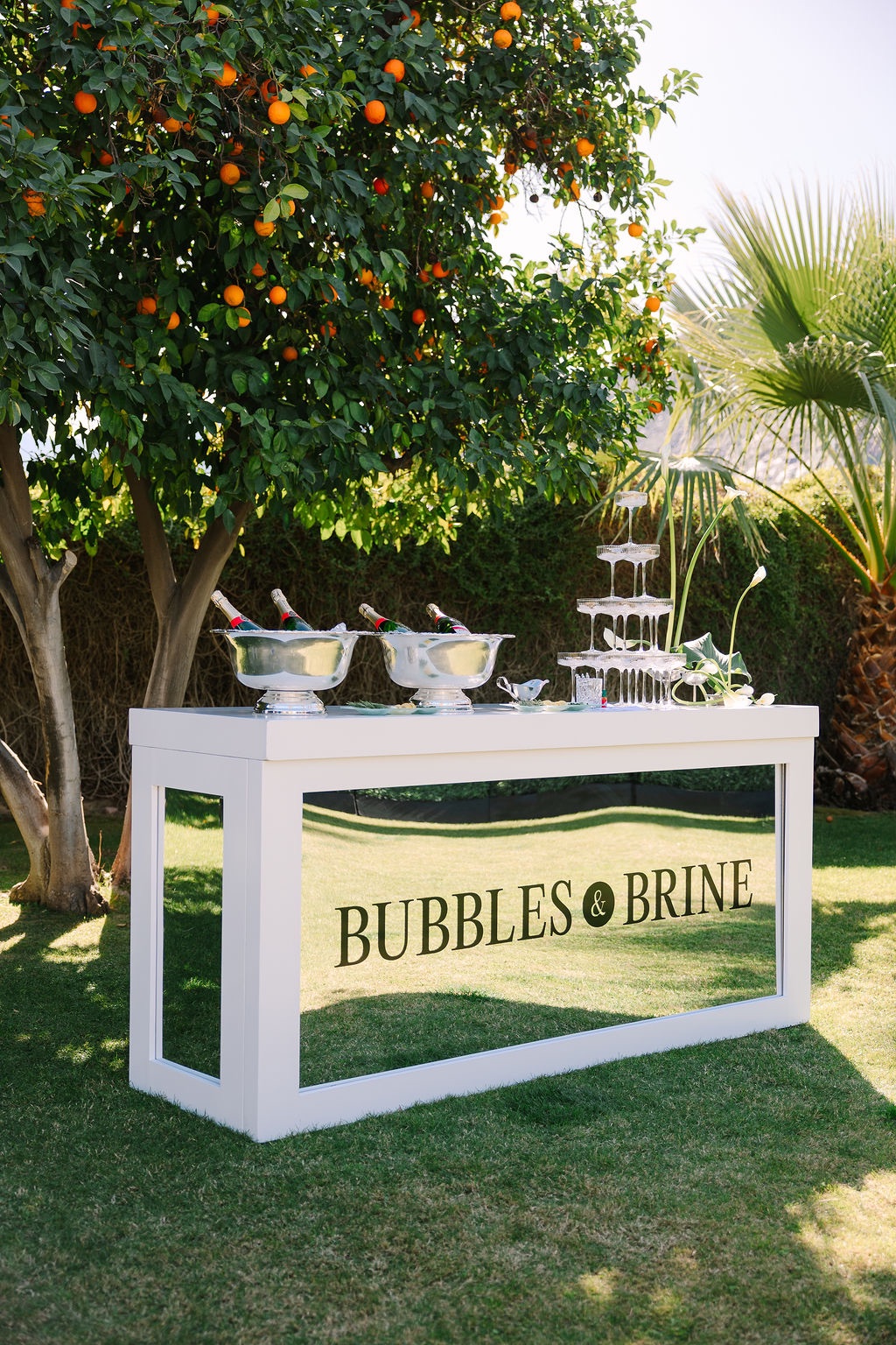
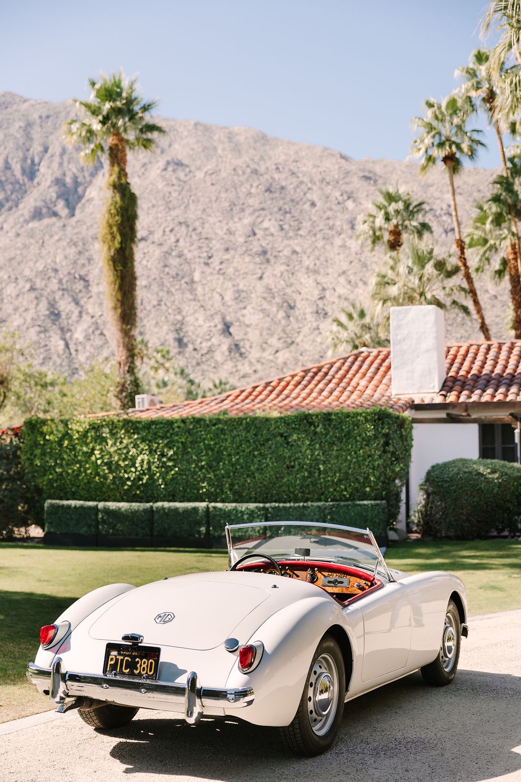
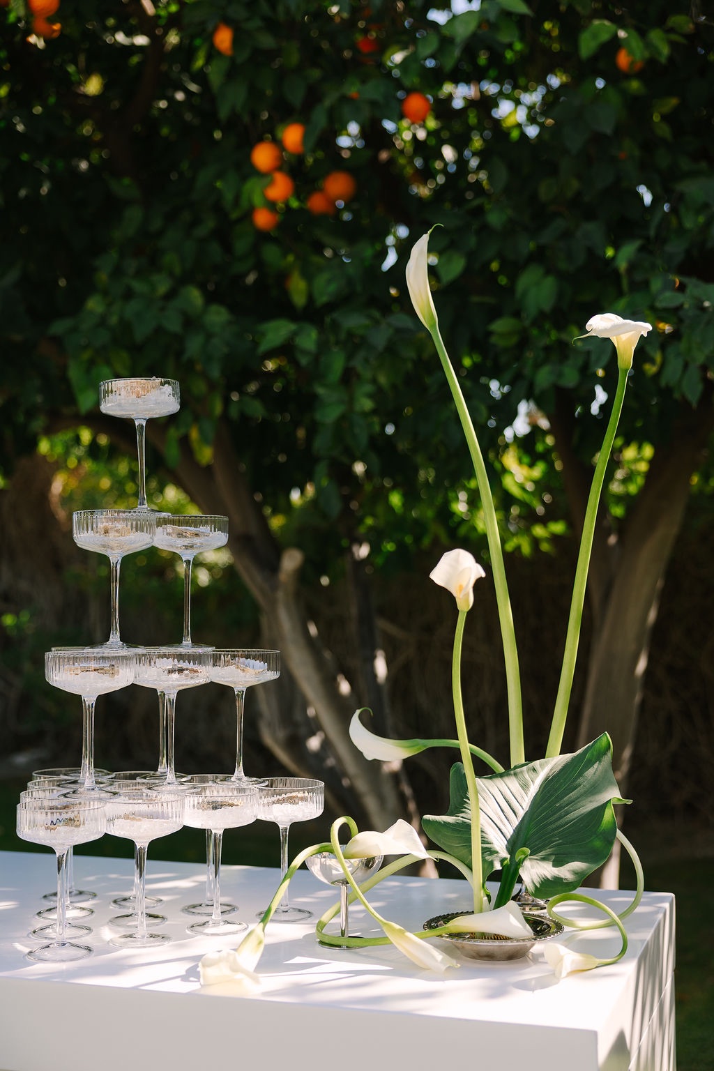
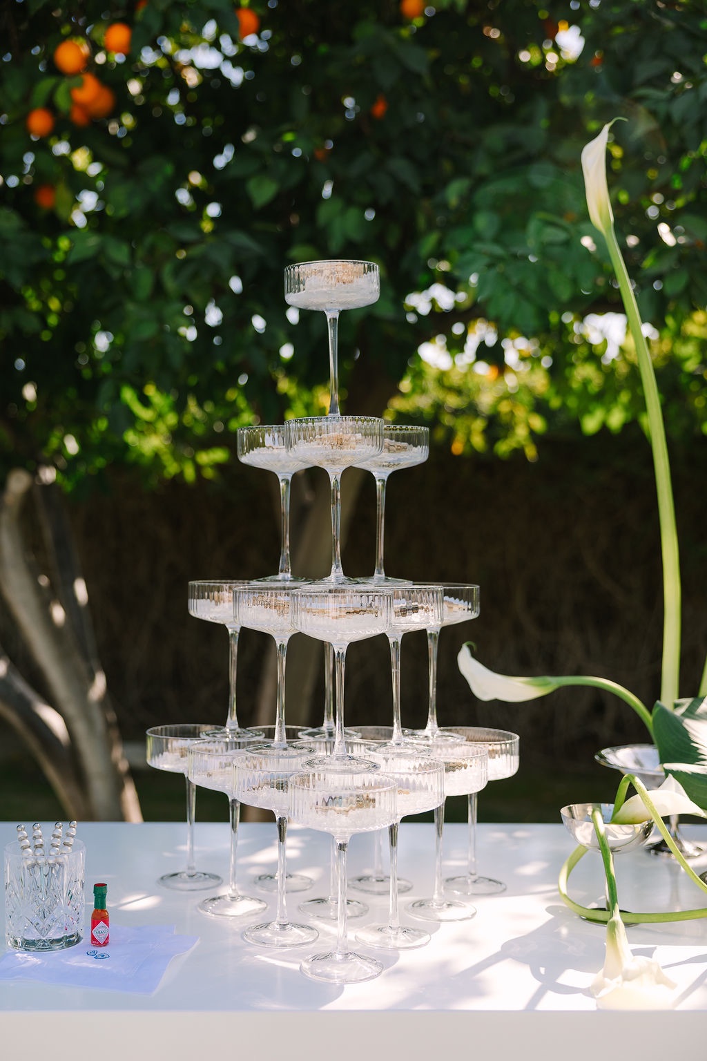
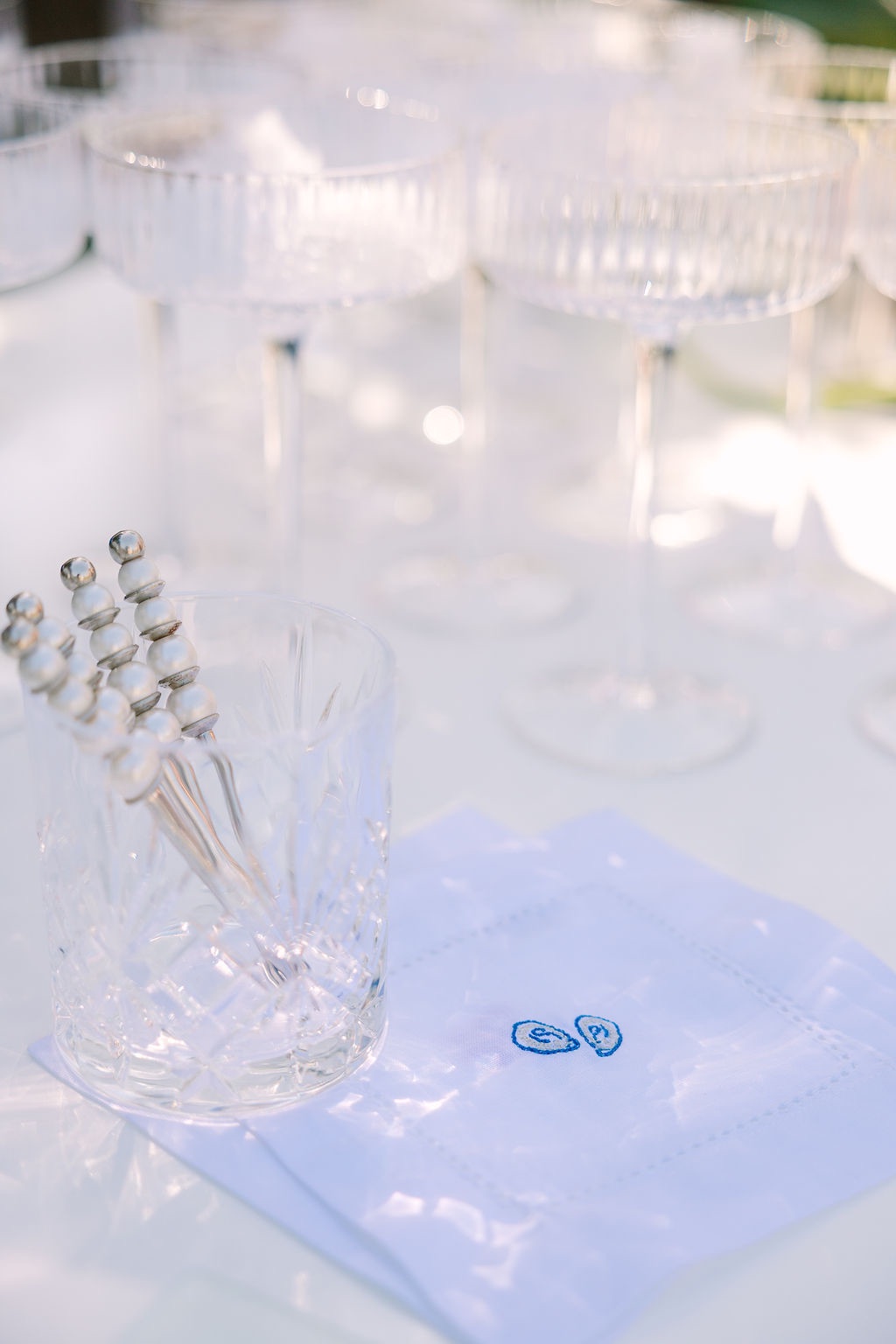
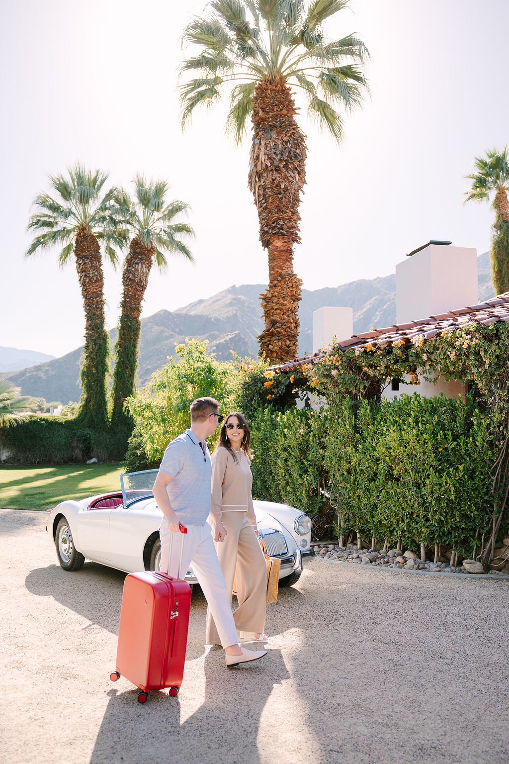
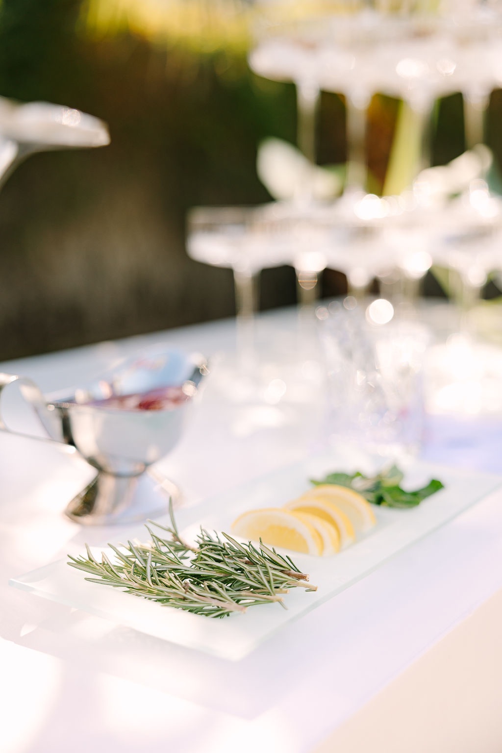
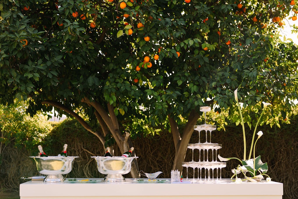
As the couple pulled up in a vintage car, champagne was served from silver punch bowls and oysters arrived in coupe glasses. The combination immediately introduced the contrasts that would define the rest of the editorial: polished but playful, nostalgic but fresh, and rooted in East Coast entertaining while unmistakably suited to Palm Springs.
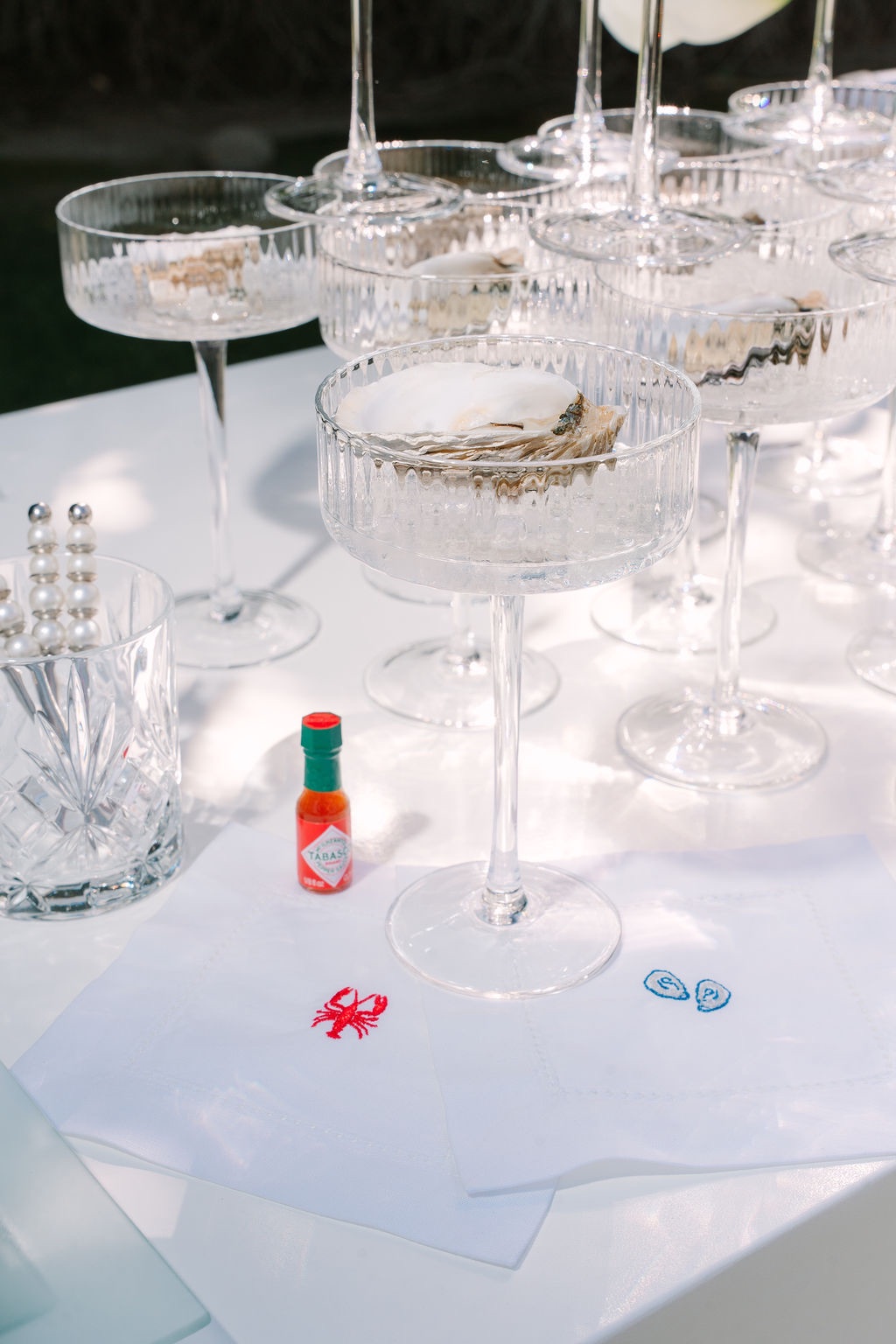
Rather than waiting for the wedding itself to establish the aesthetic, the arrival moment made the entire weekend part of the design.
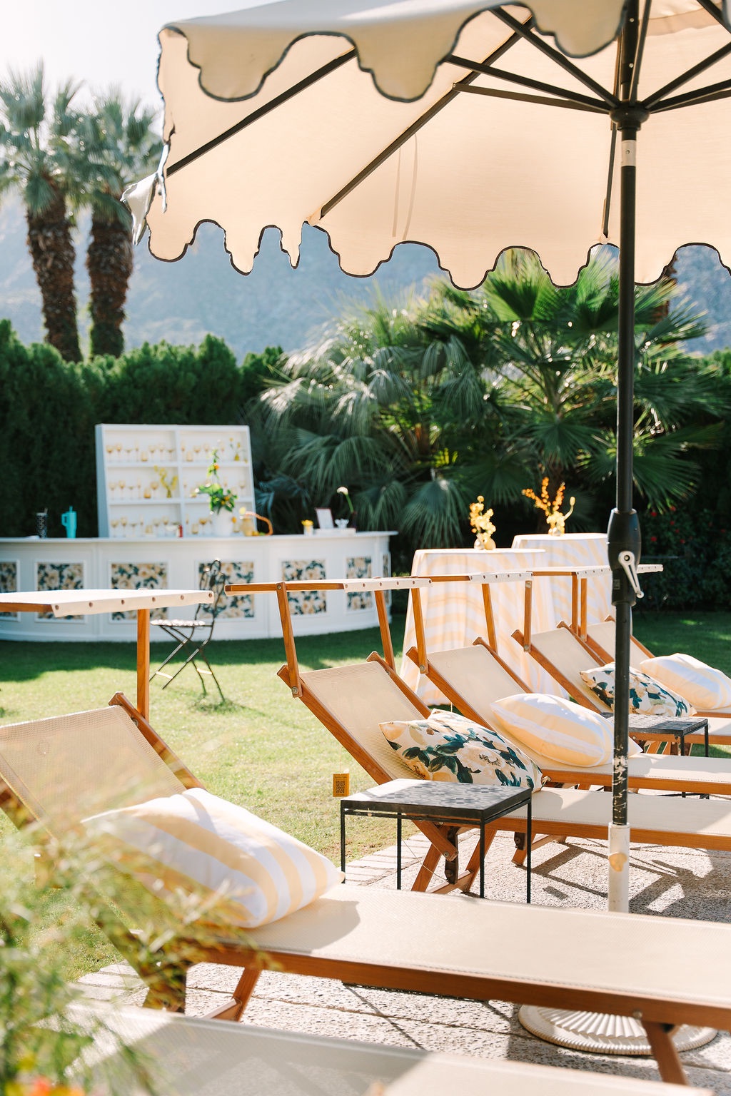
A retro pool party with a tailored twist
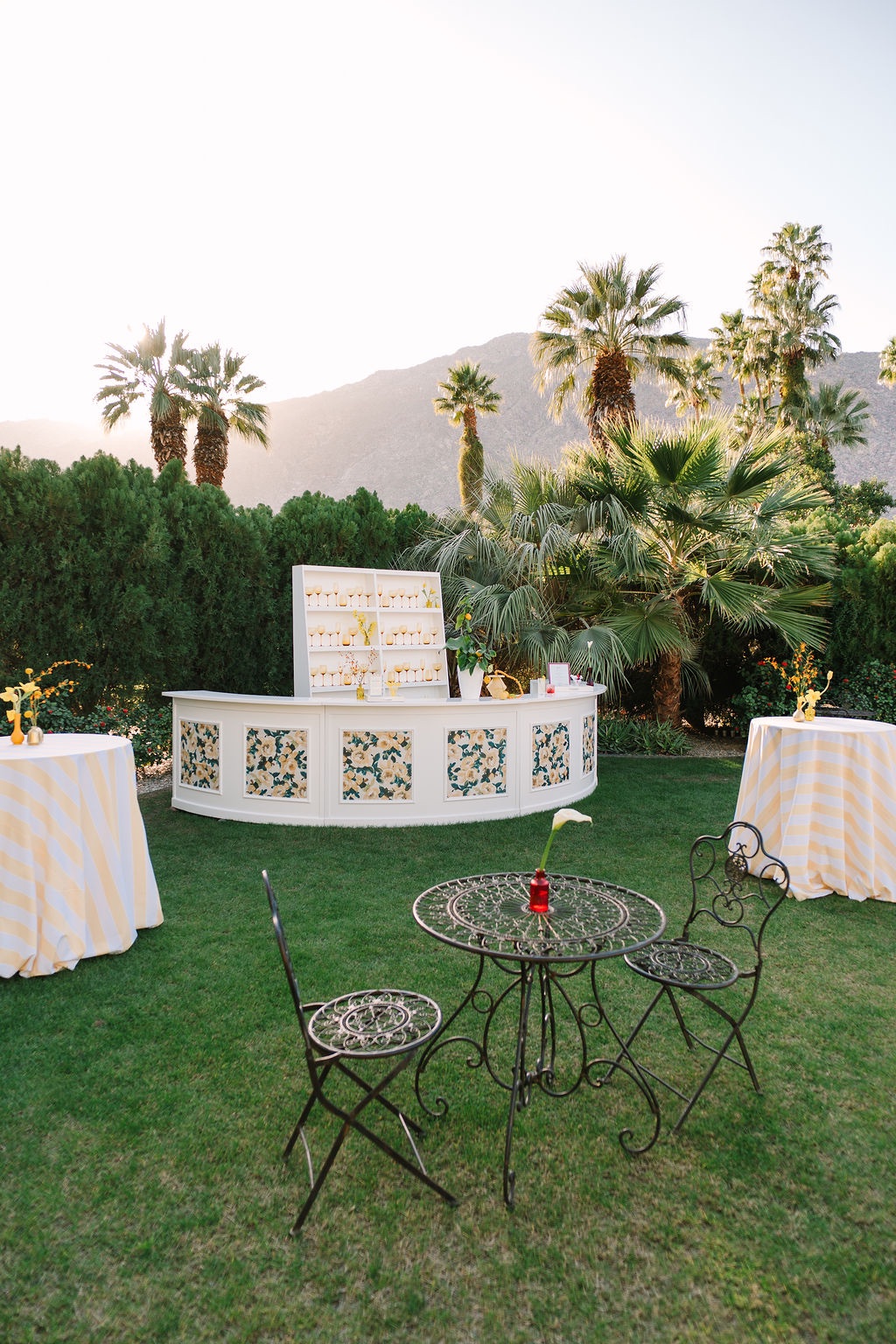
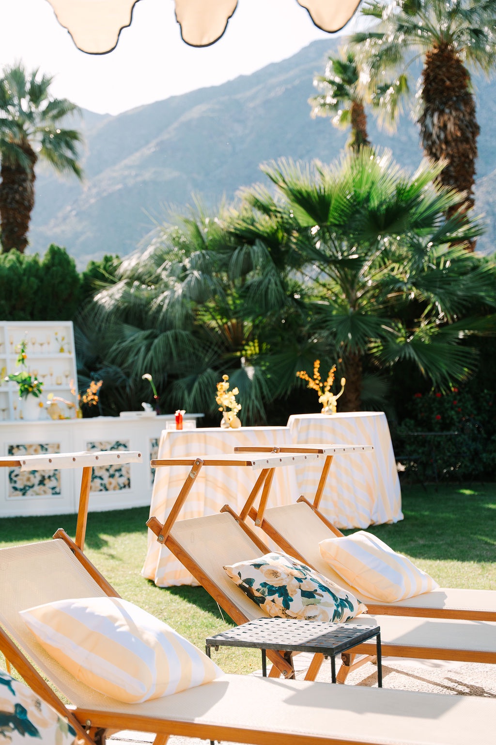
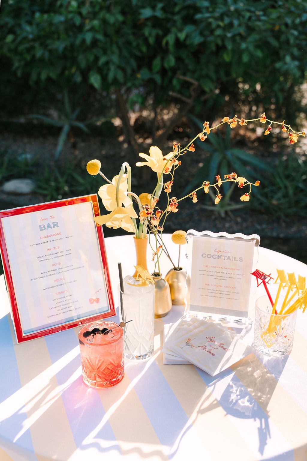
From there, the welcome celebration moved poolside, where the mood became increasingly playful.
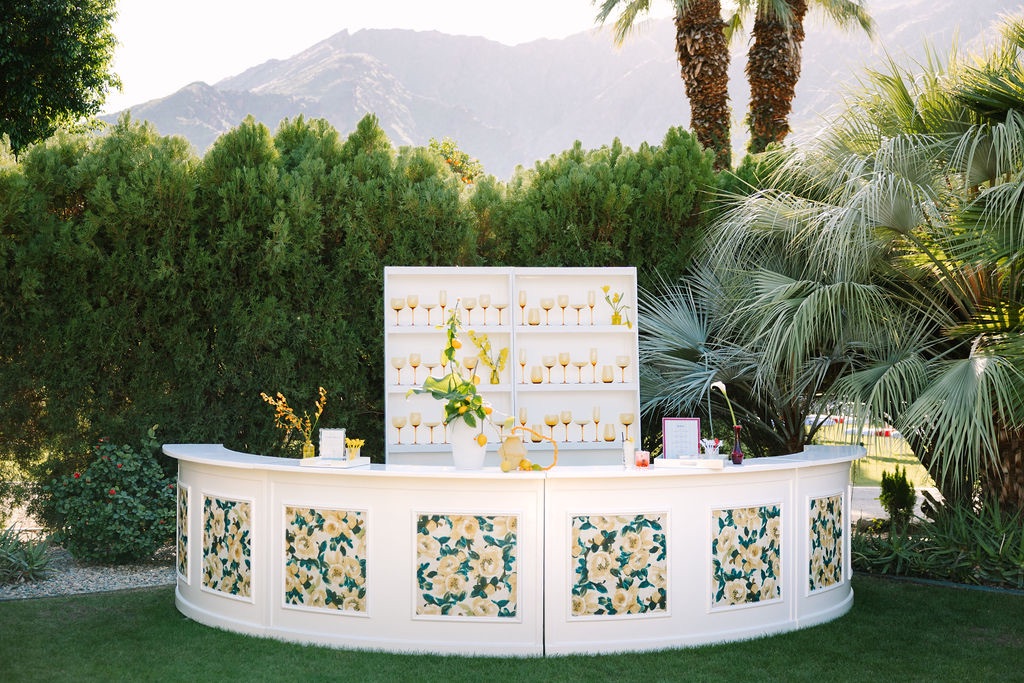
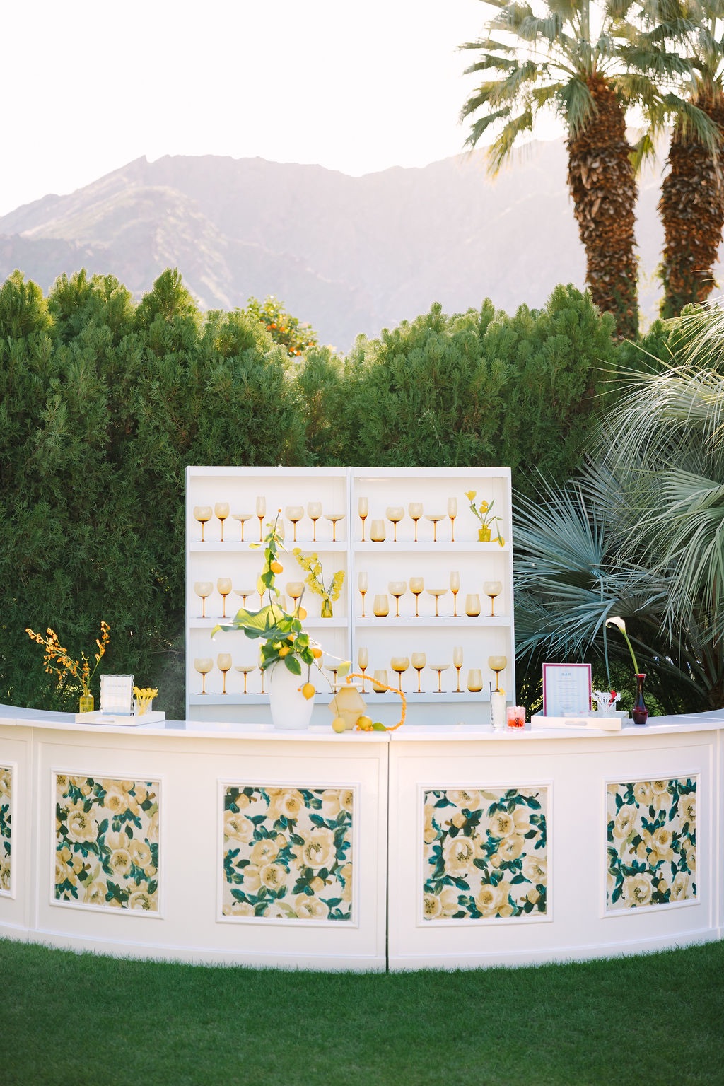
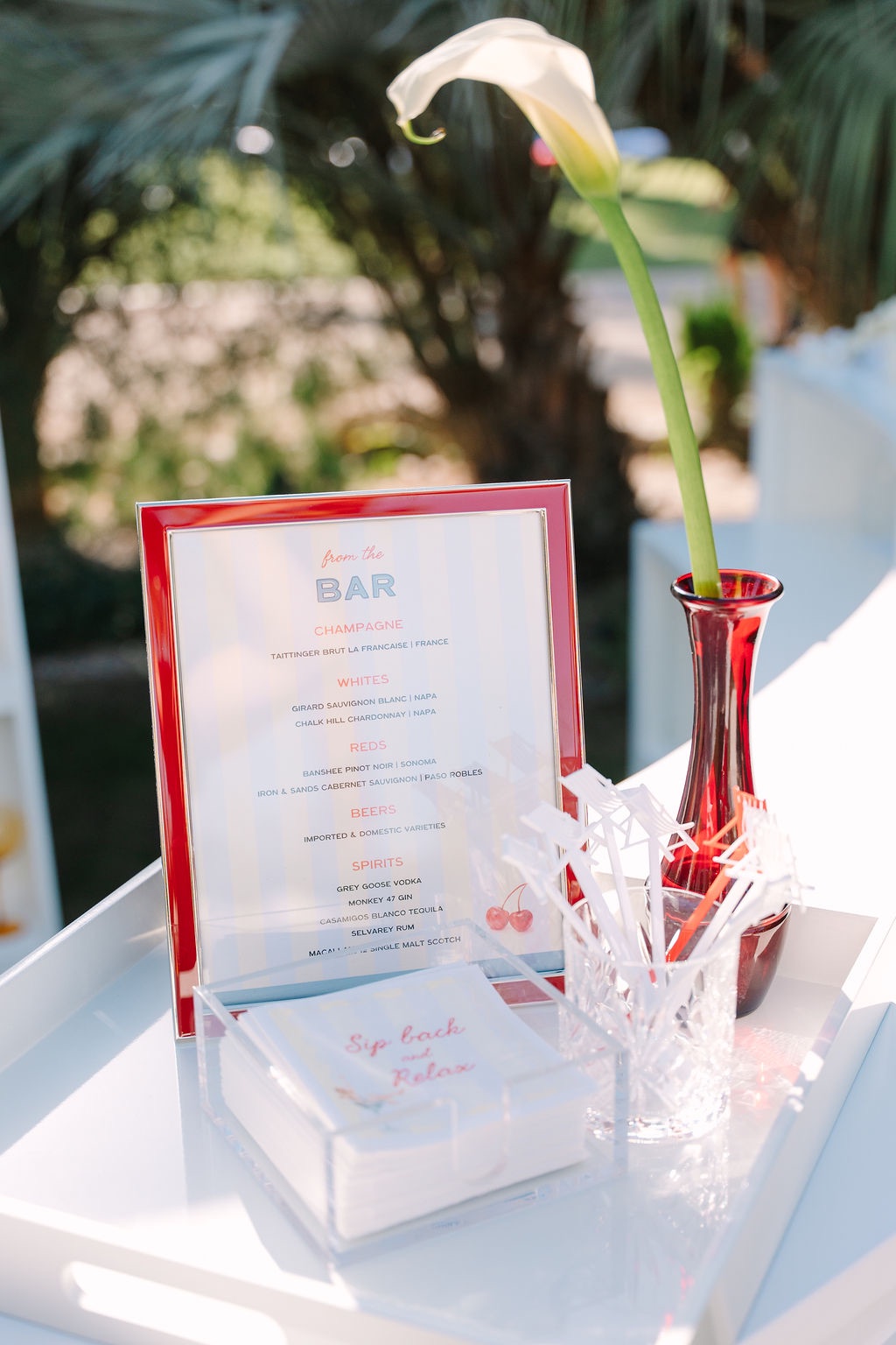
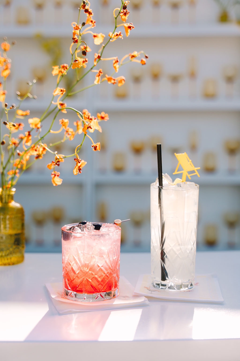
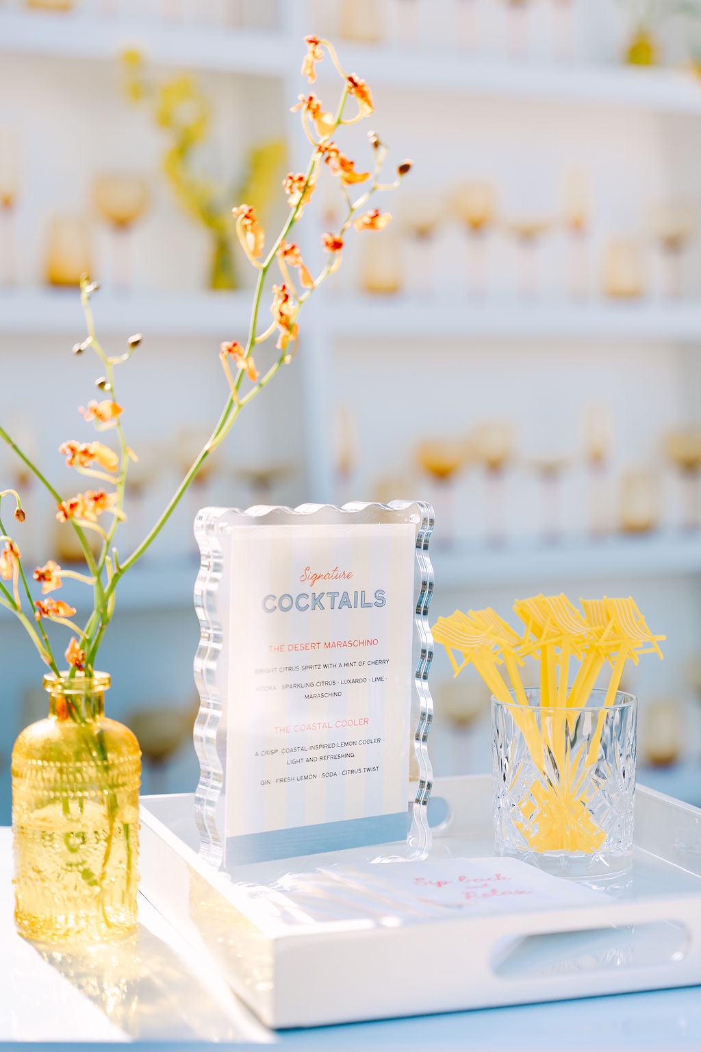
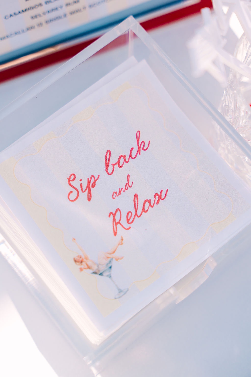
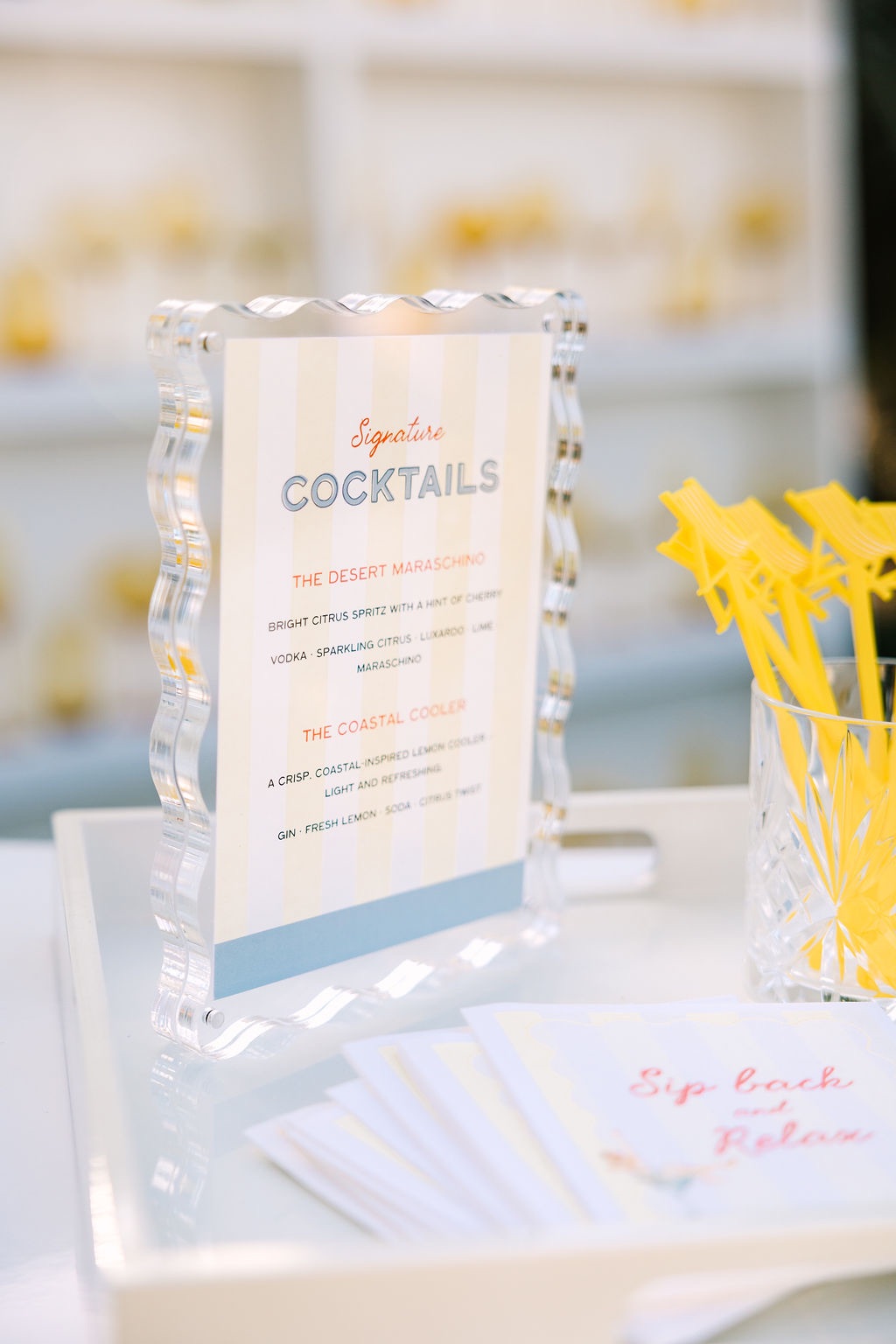
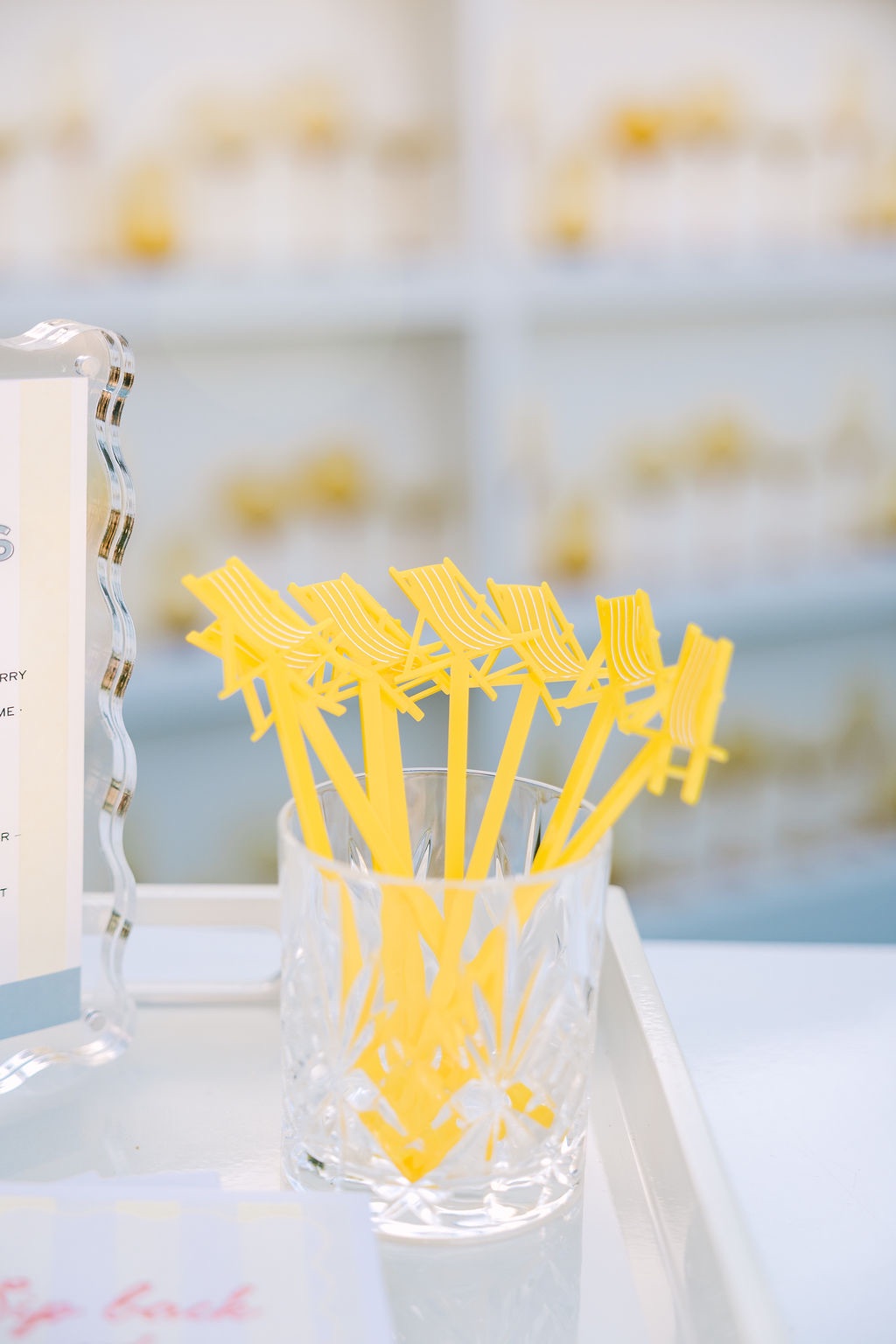
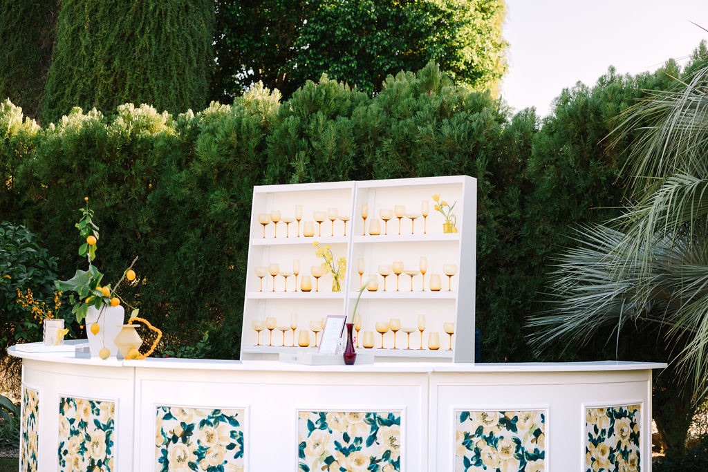
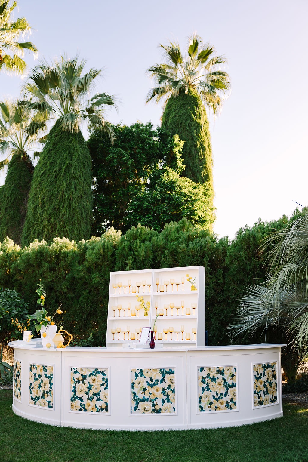
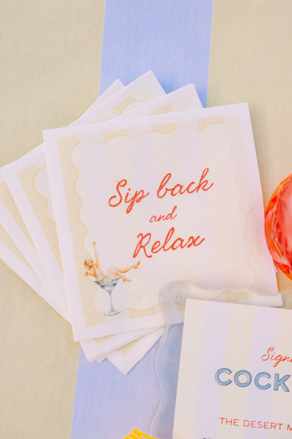
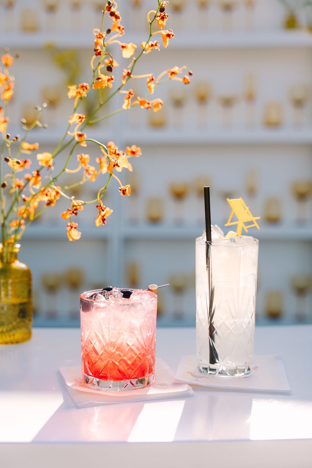
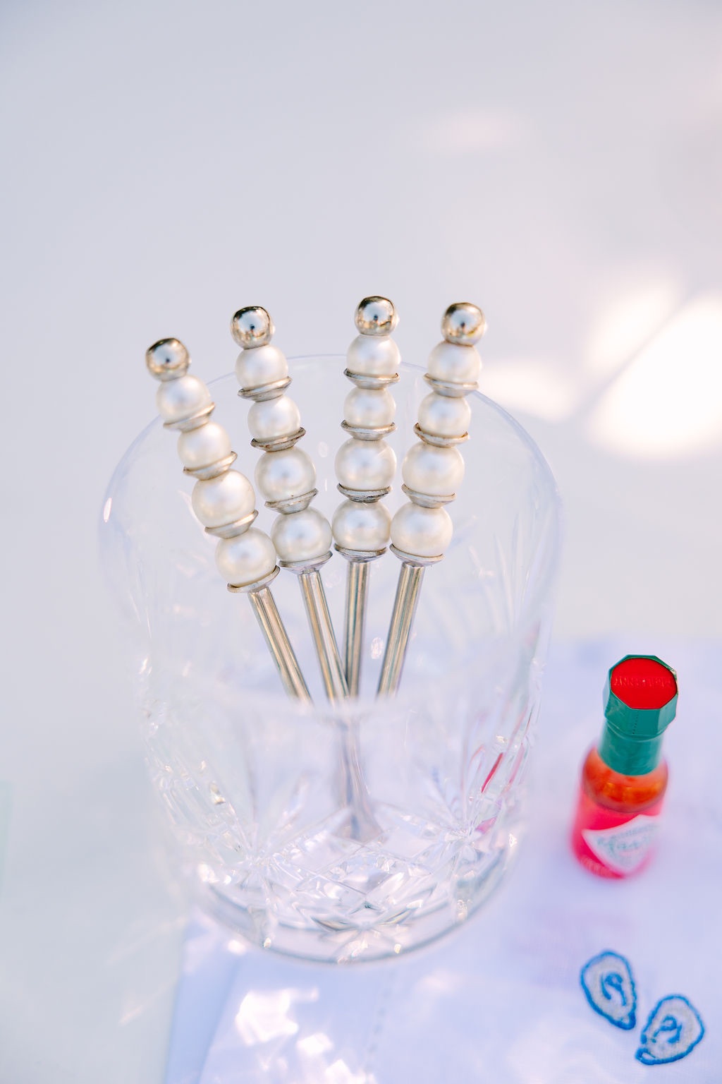
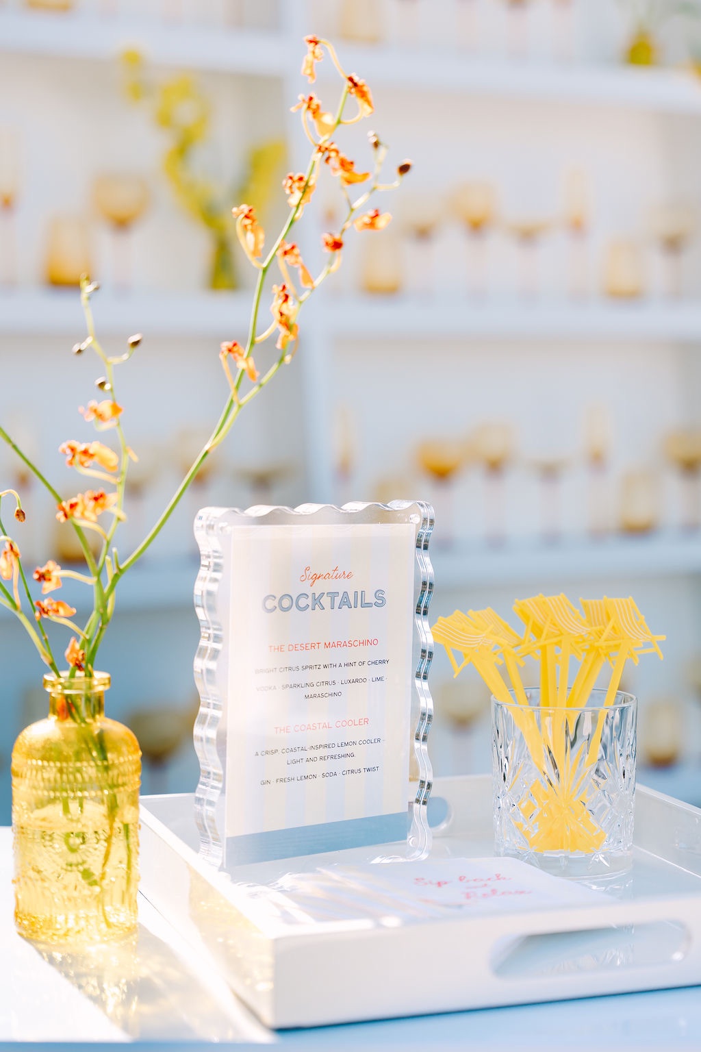
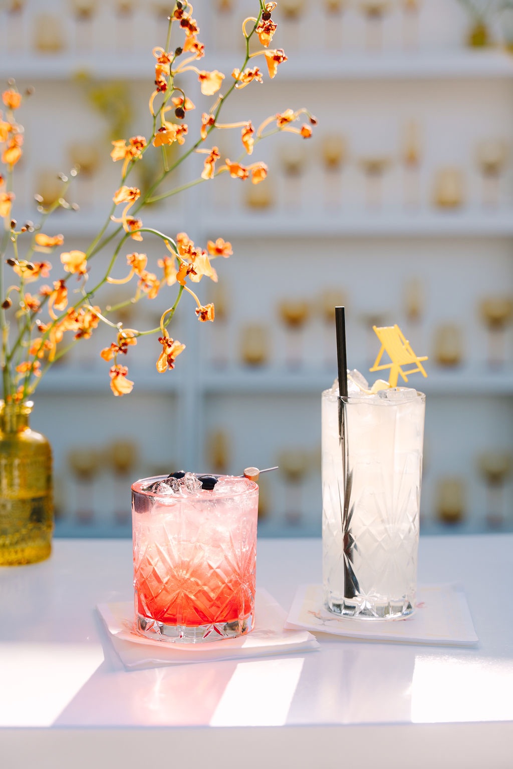
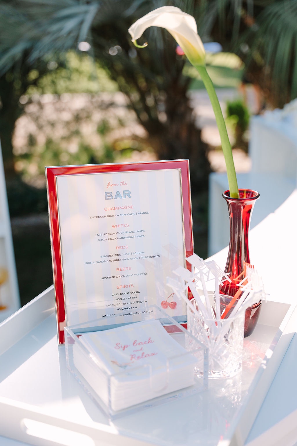
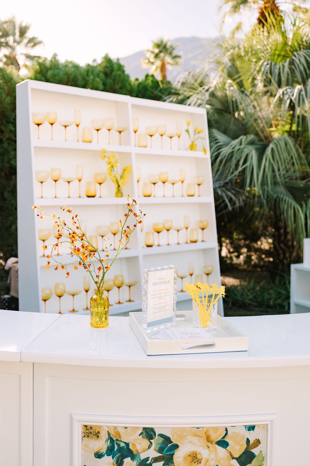
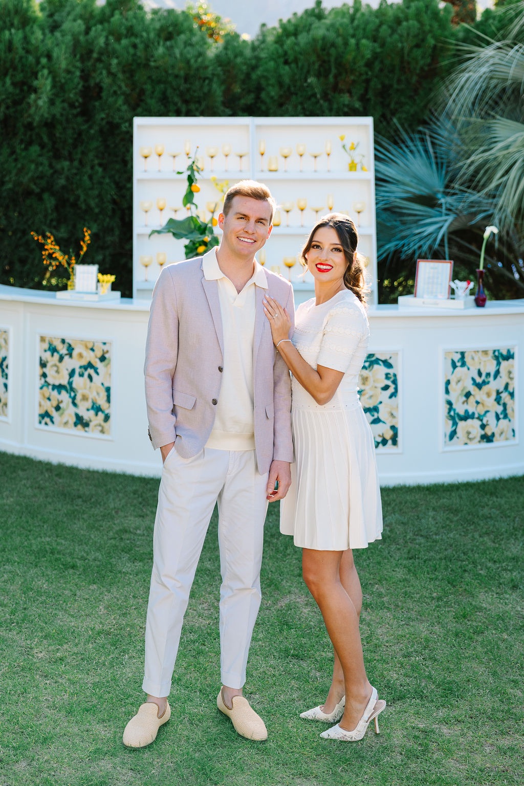
Retro-inspired signage and custom drink names brought personality into the setting, while slingback chair stir sticks turned an iconic Palm Springs silhouette into one of the weekend’s smallest custom details.
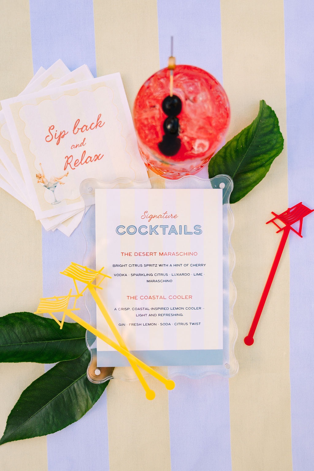
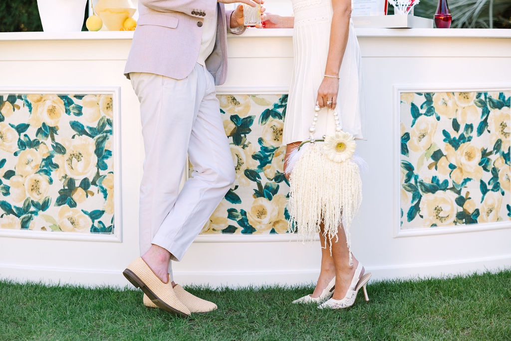
The poolside atmosphere also gave the more traditional elements of the concept room to loosen up. Tailored patterns and polished details suddenly felt less formal when placed beside the water and surrounded by the warm, nostalgic character of Ingleside Estate.
You may also like
A funky desert disco wedding with florals installed stem by stem
Classic beauty with a vibrant twist for this Palm Springs wedding
A black and white oasis wedding in the heart of Palm Springs
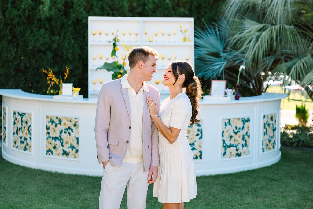
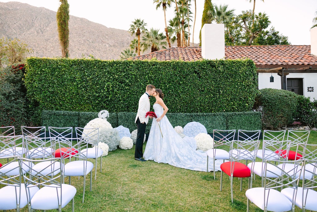
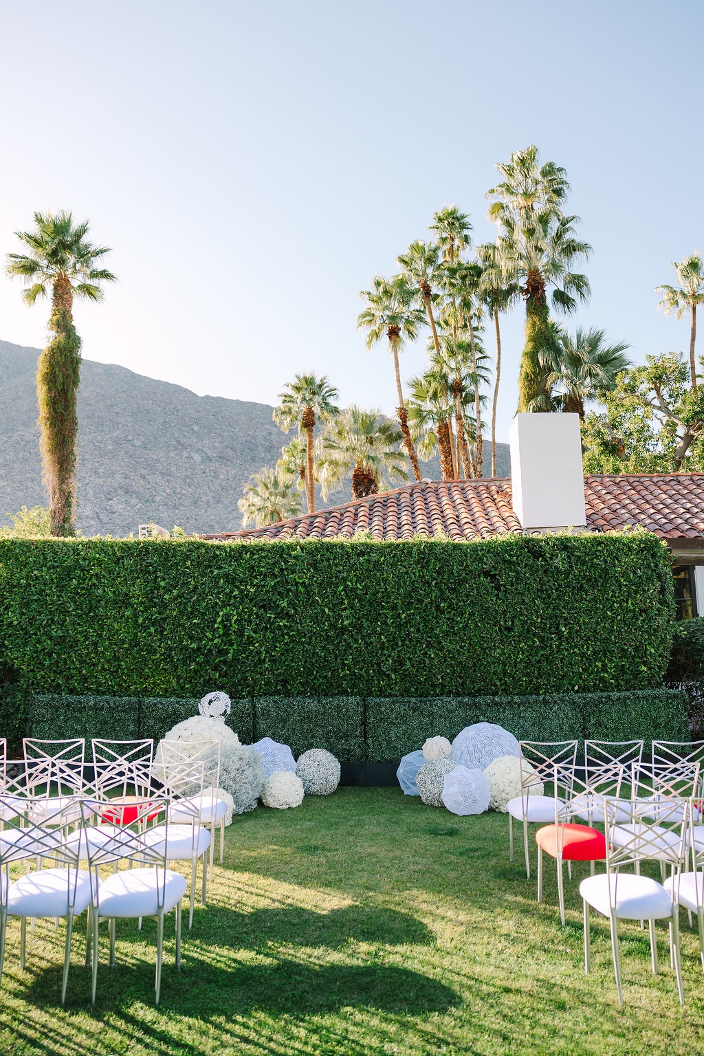
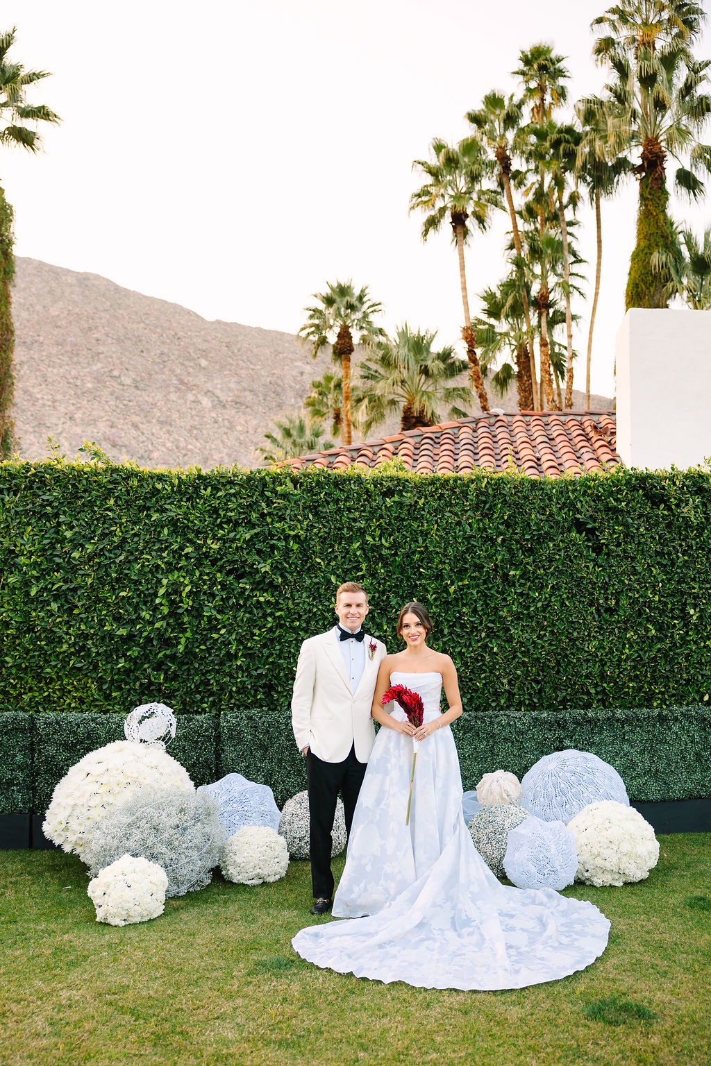
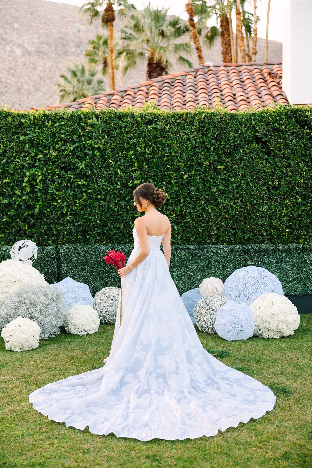
Topiary spheres brought structure to the ceremony
After the relaxed energy of the welcome party, the ceremony intentionally shifted into a more tailored direction.
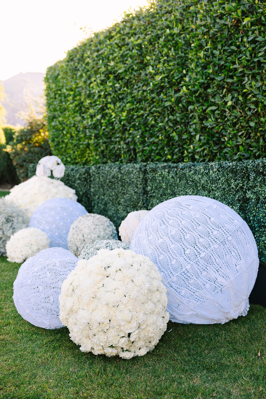
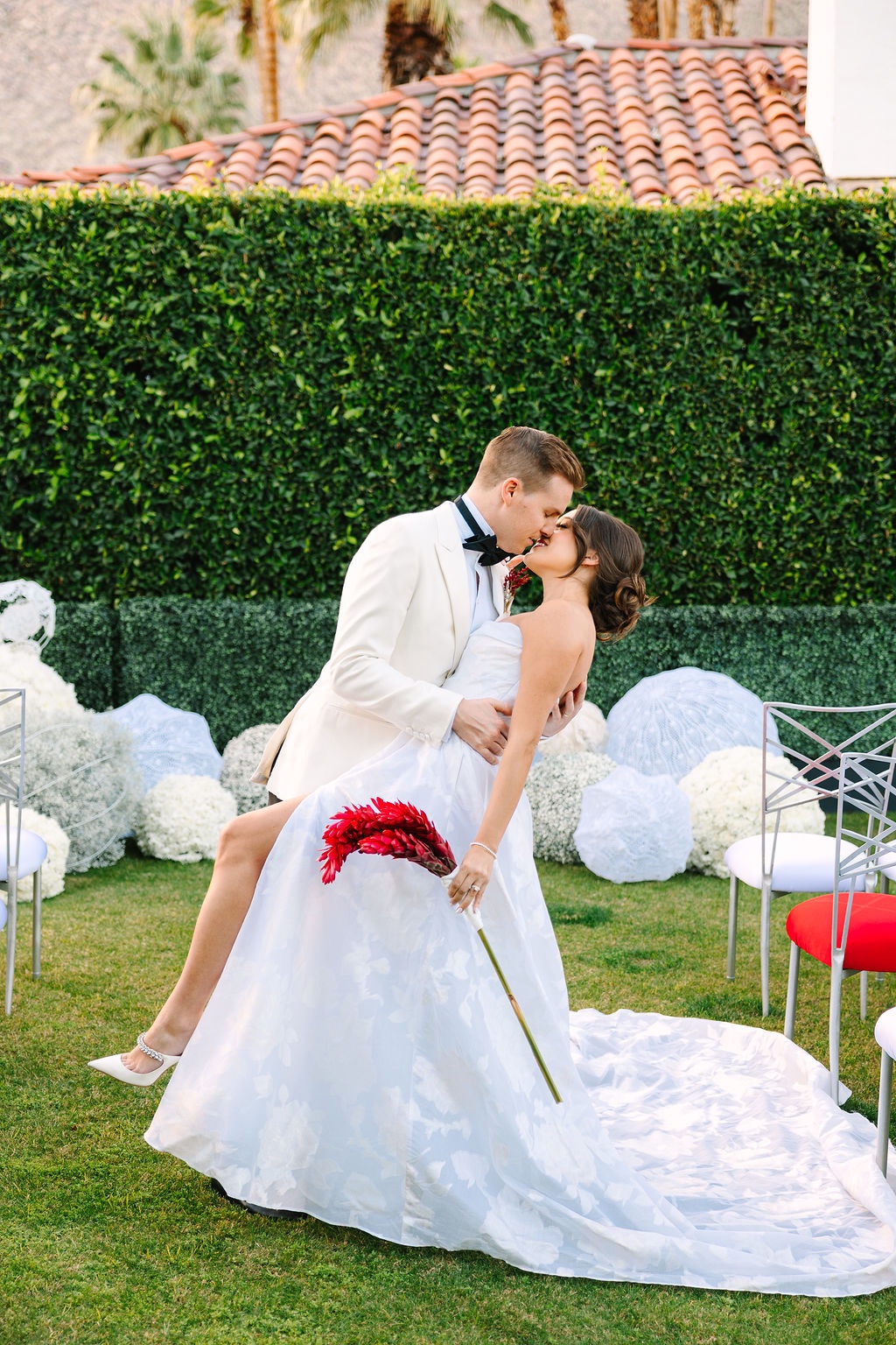
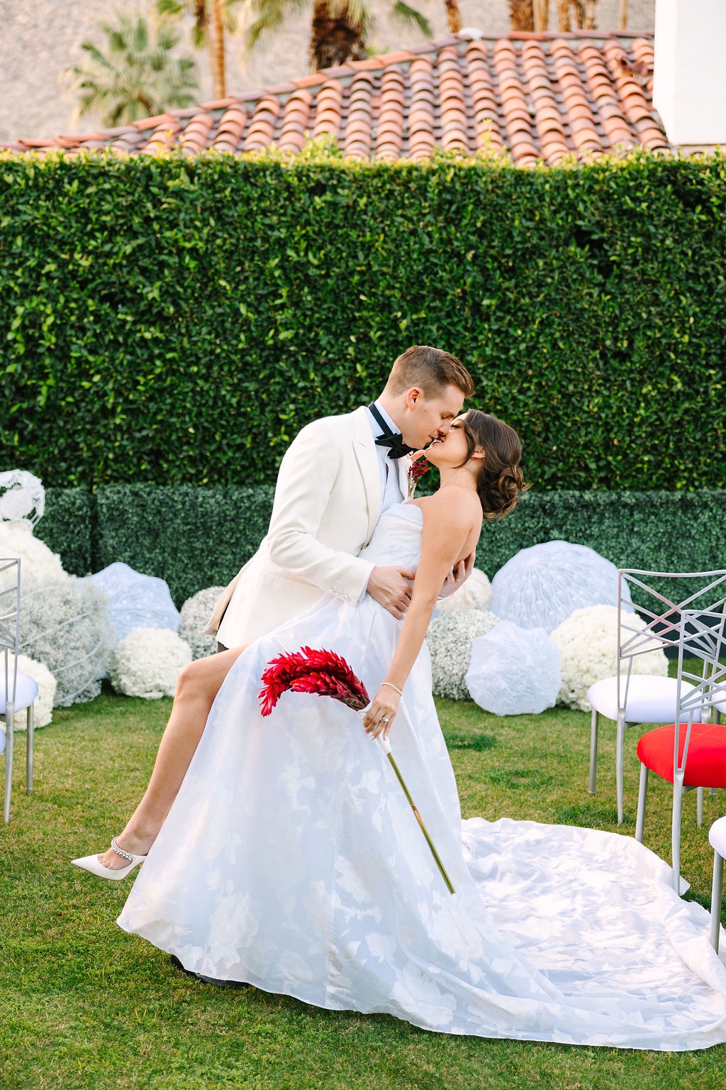
Topiary spheres and sculptural florals introduced stronger shapes and a sense of structure to the setting. The more controlled floral forms created a visual counterpoint to the playful details that had appeared earlier in the weekend.
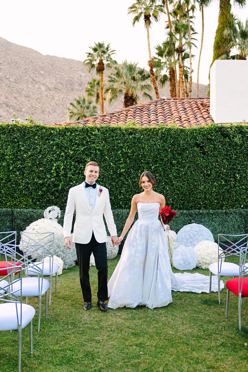
That contrast gave each portion of the editorial its own atmosphere without requiring an entirely new design language. Color and botanical elements remained consistent, but their treatment evolved as the imagined wedding weekend progressed.
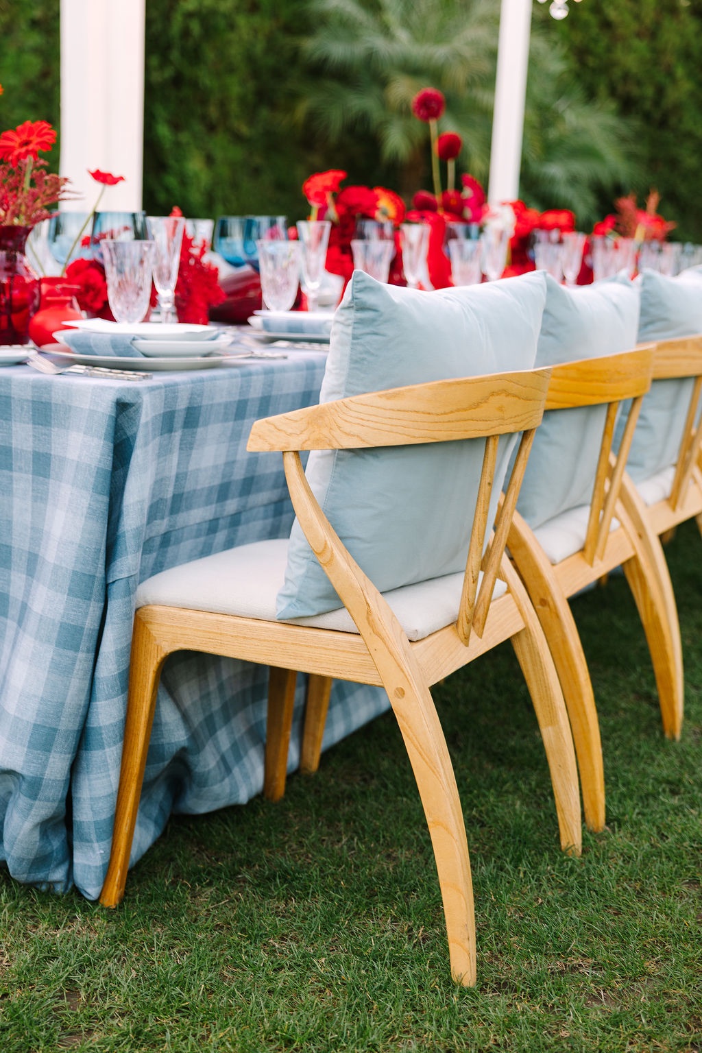
Plaid linens made the case for spring tartan
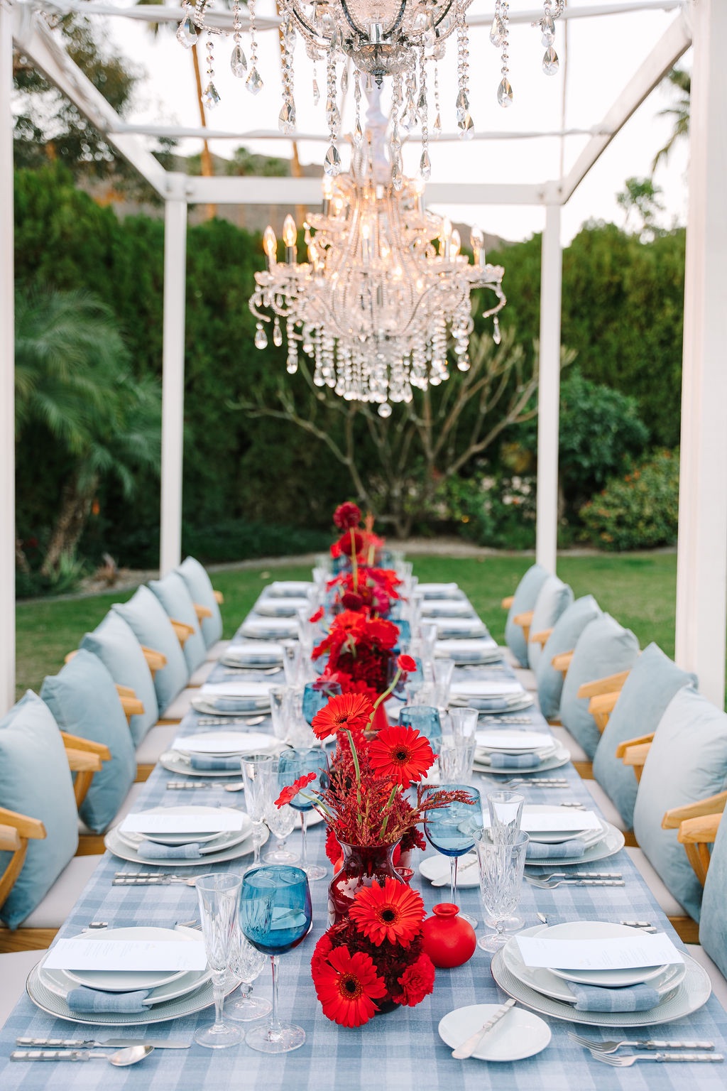
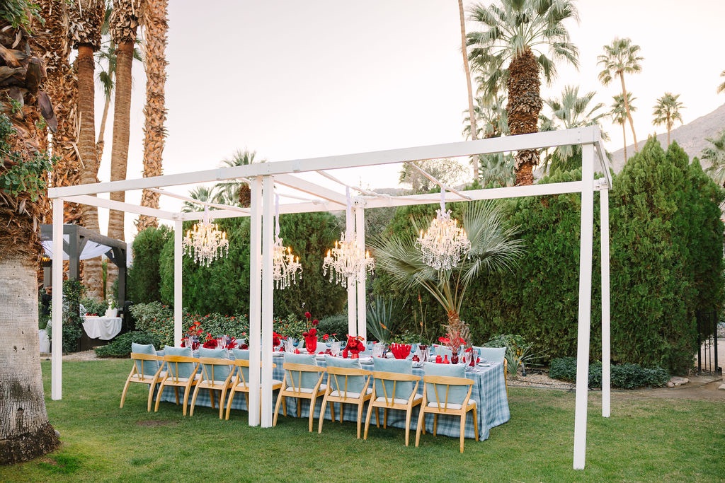
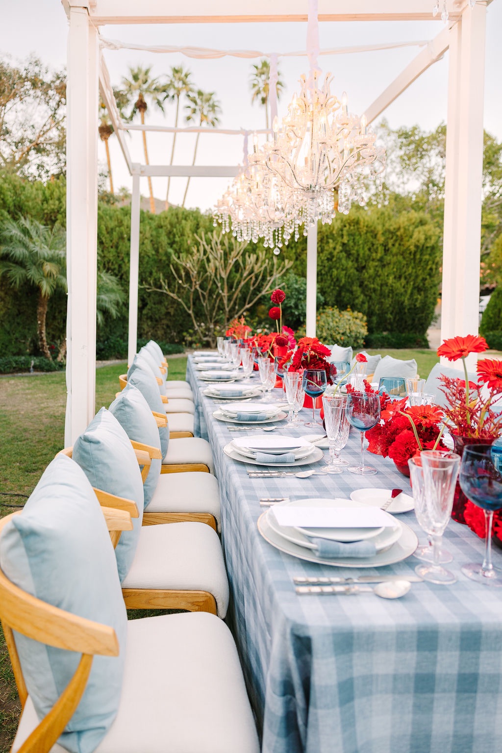
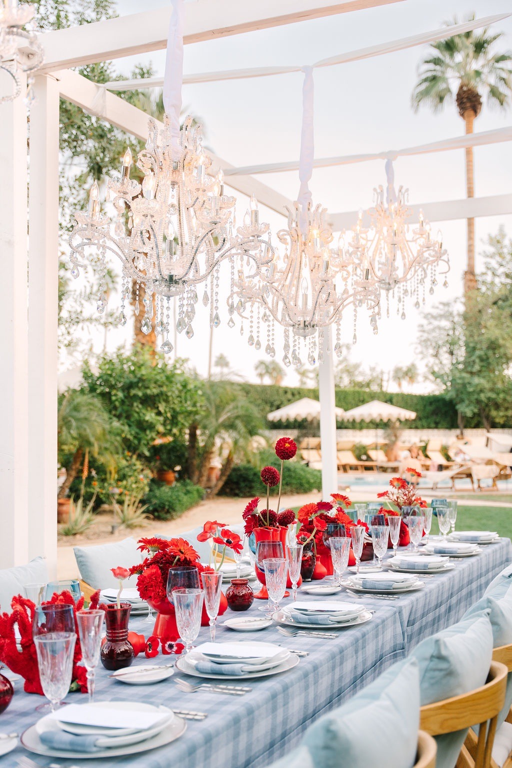
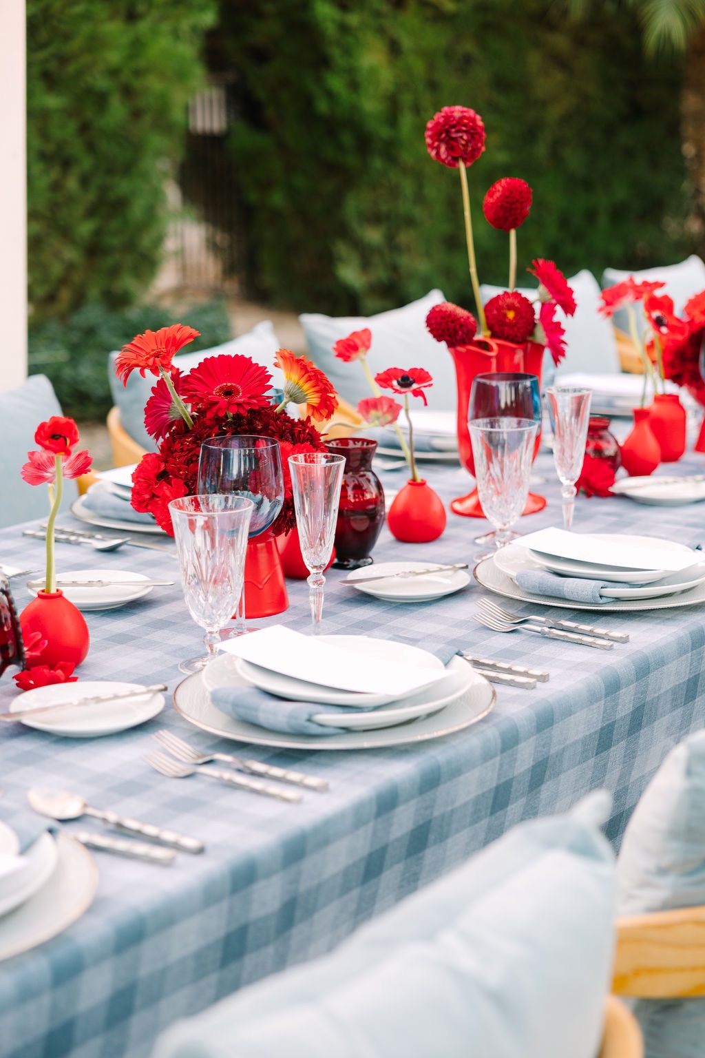
At the reception, plaid became one of the defining elements of the tablescape.
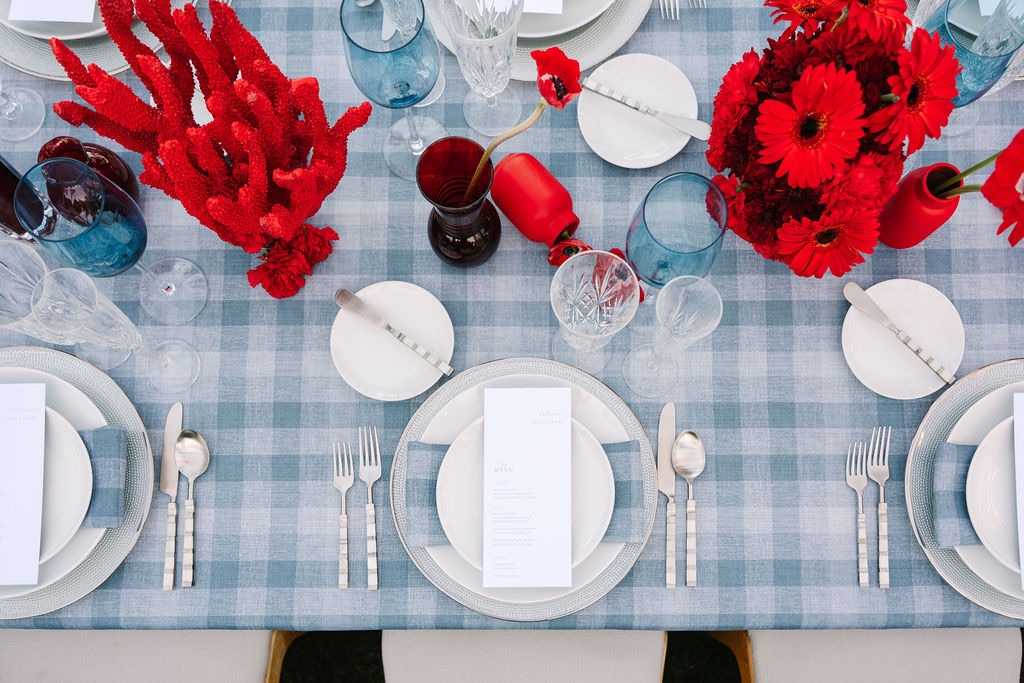
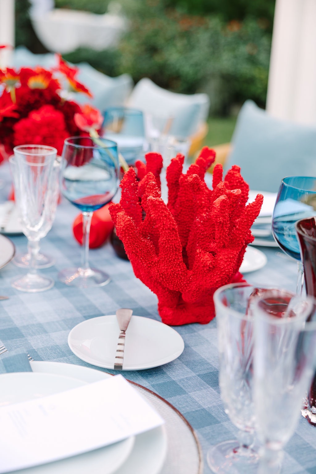
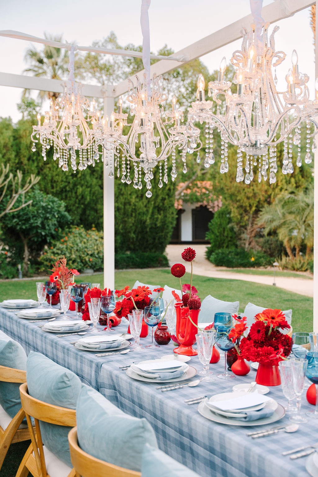
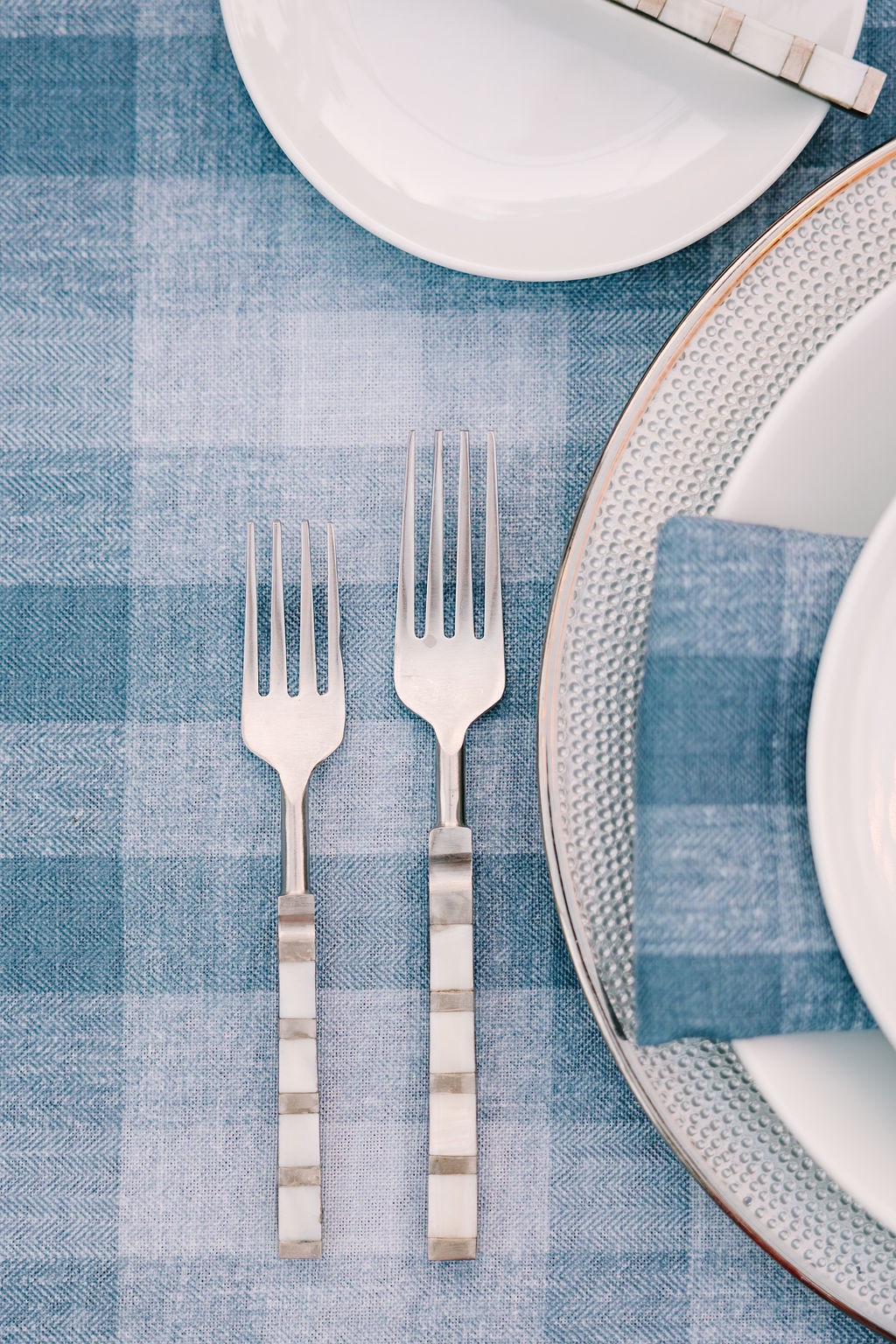
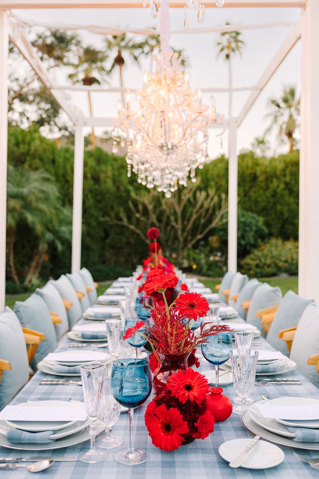
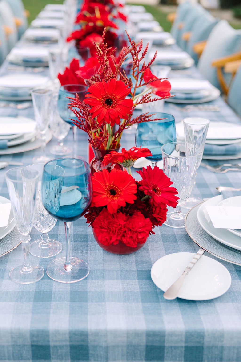
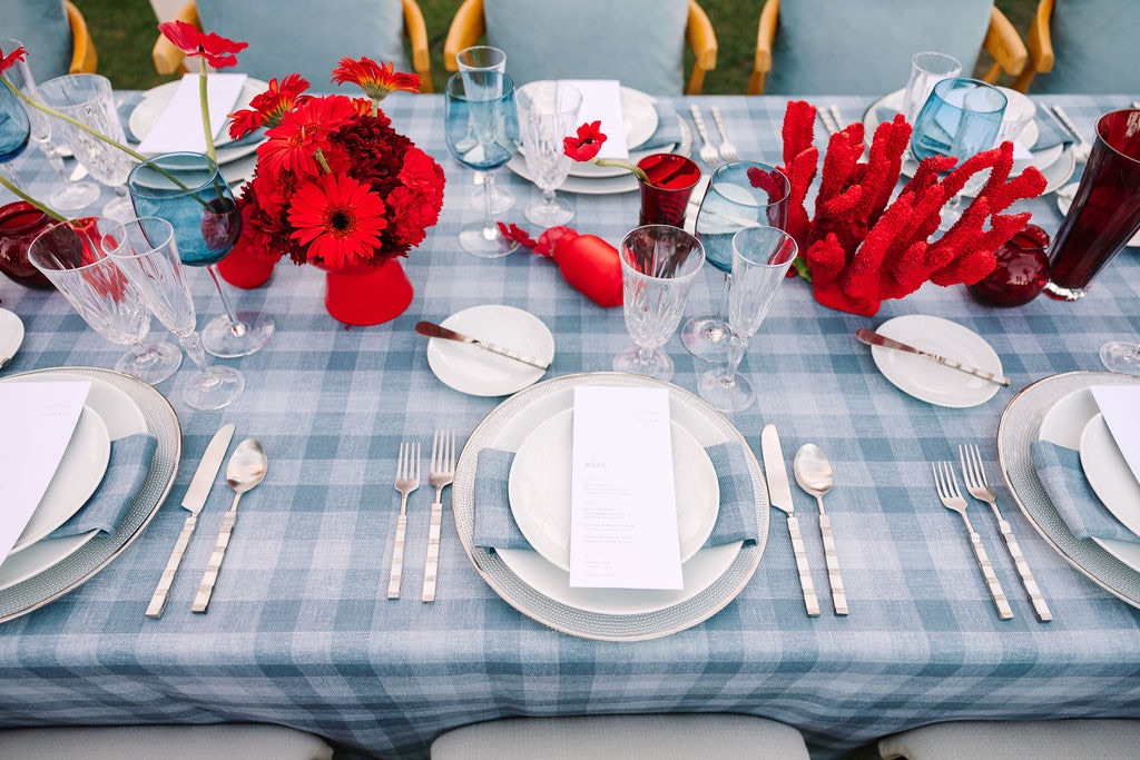
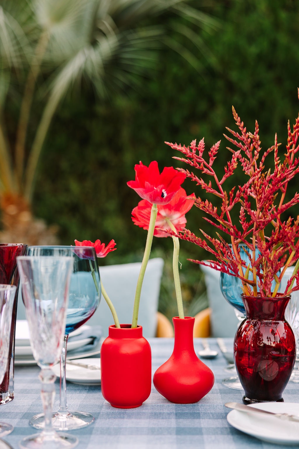
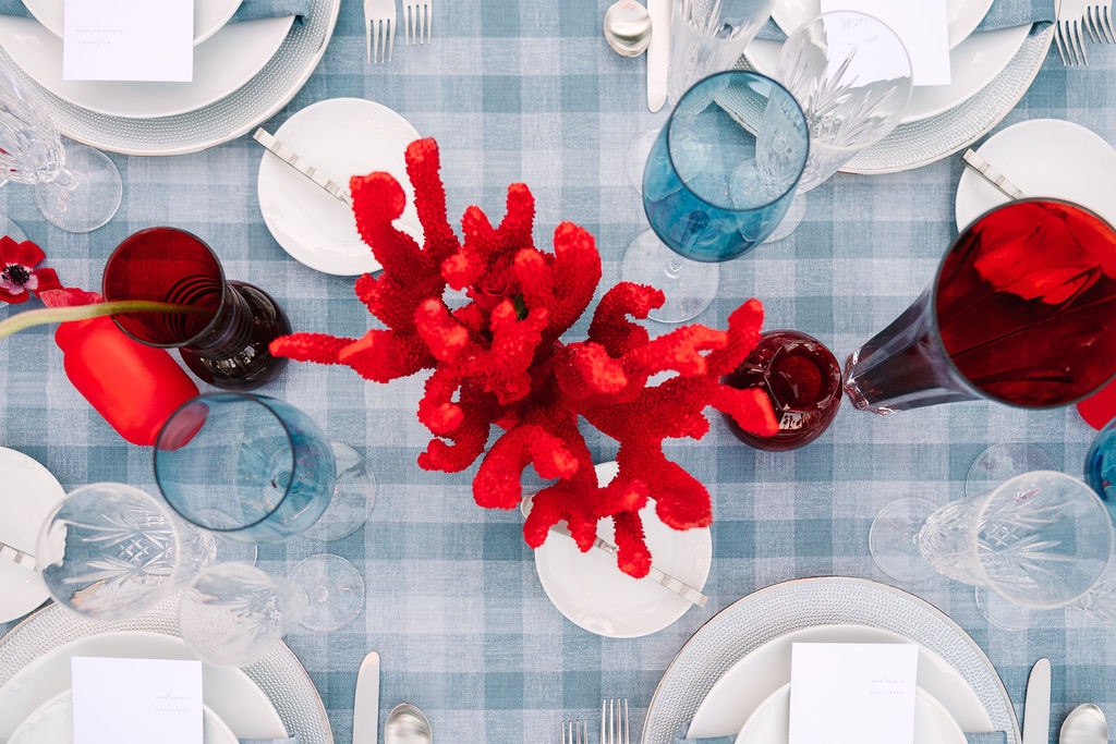
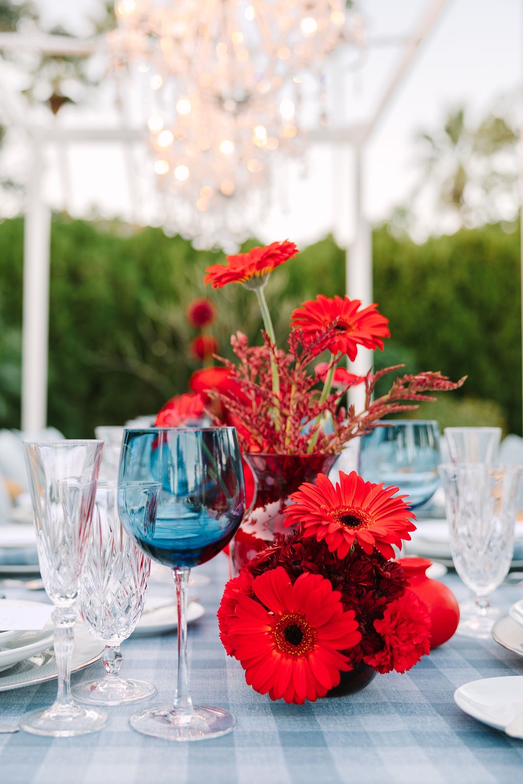
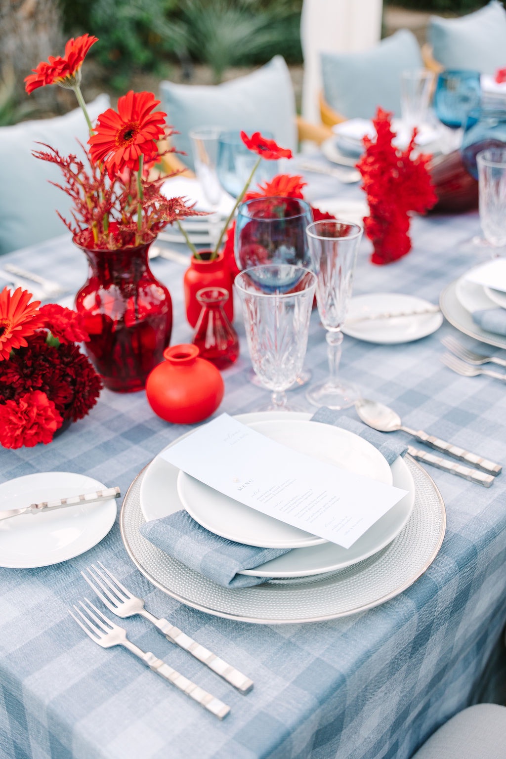
Rather than using the pattern in the darker, heavier colors often associated with fall and winter, the editorial reimagined it within the bright Palm Springs palette. Plaid linens from Reverie Social were layered with coral-toned florals, allowing a traditionally seasonal pattern to feel lighter and more appropriate for spring or early summer.
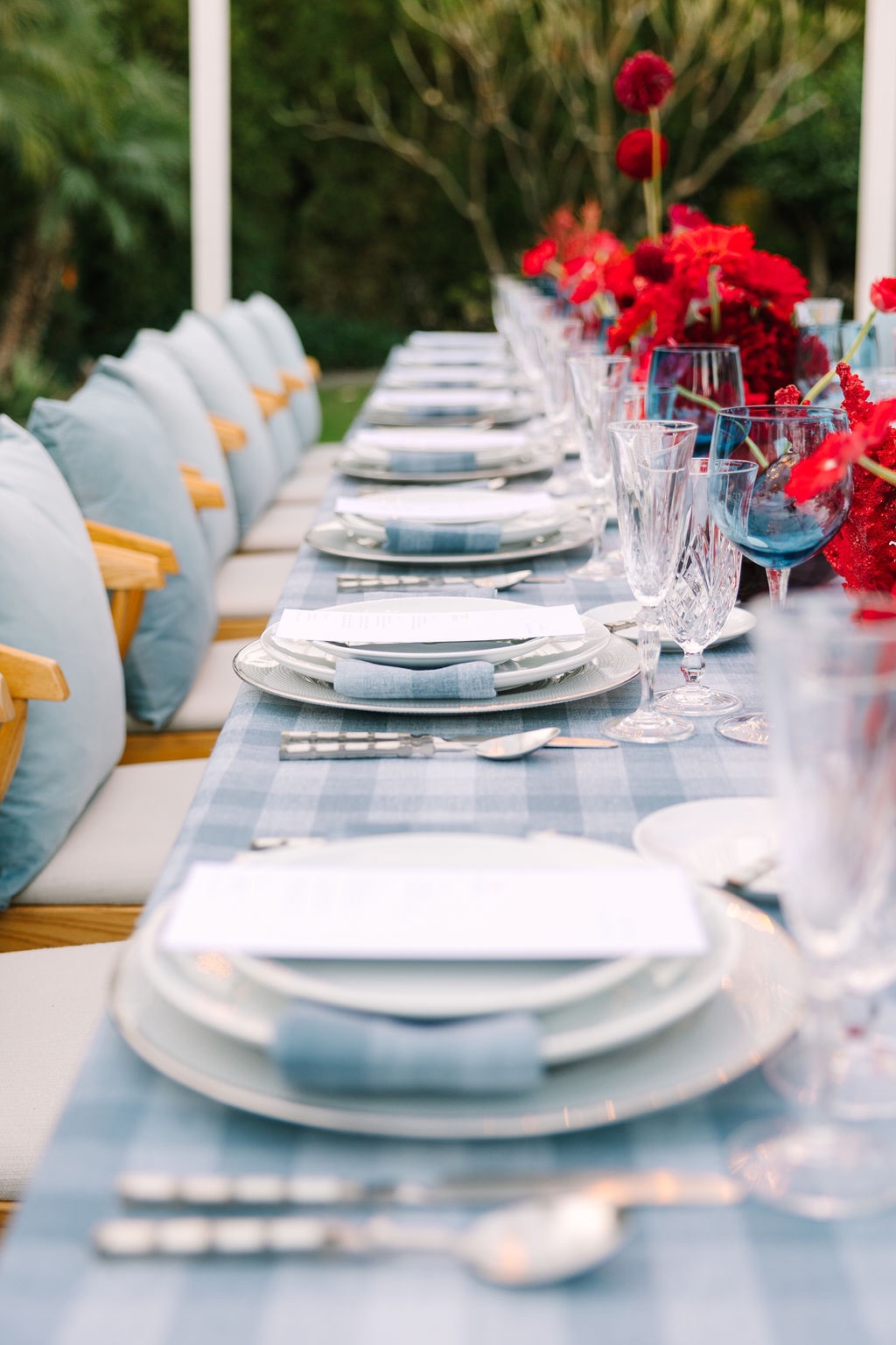
Against the California setting, the tailored pattern brought in the Cape Cod influence without making the reception feel themed. It was less about recreating an East Coast wedding in the desert and more about borrowing its sense of polish.
Tomatoes made their way into the florals
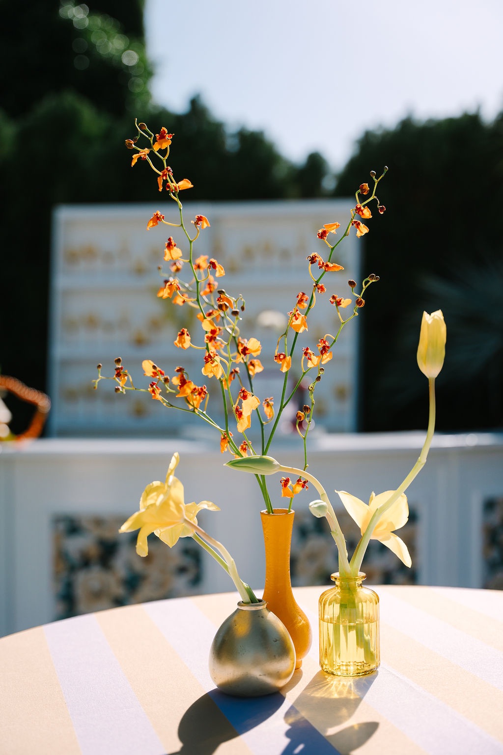
Even the floral design by The House of Florals played with expectations.
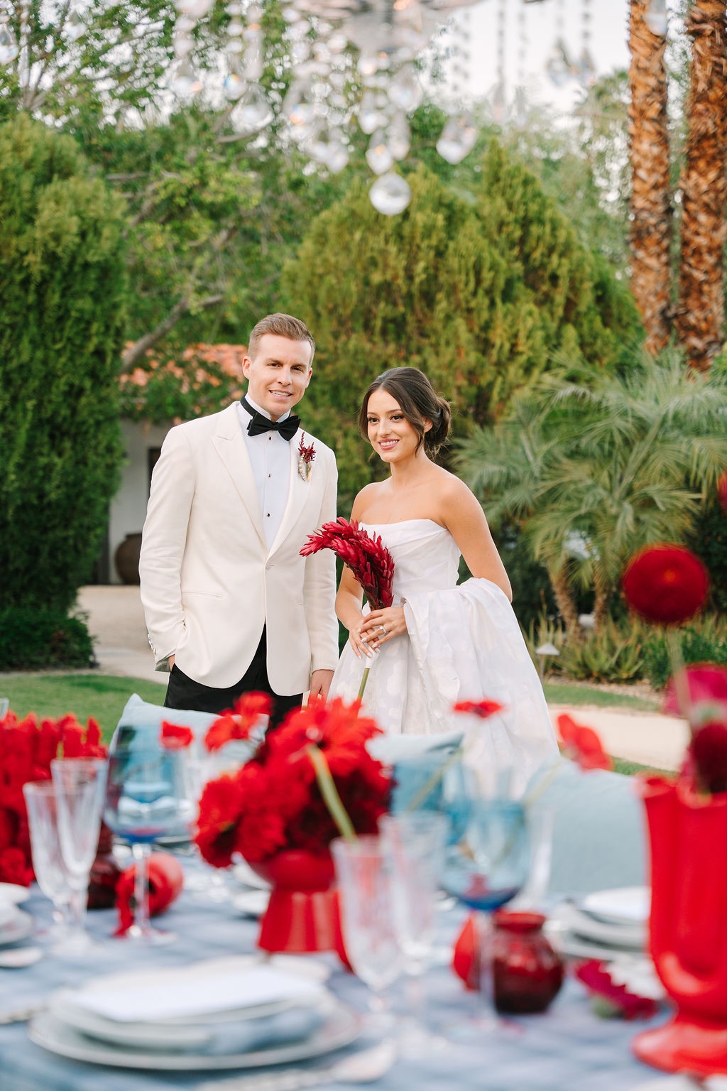
Tomatoes were incorporated among the flowers, adding an organic and slightly unexpected element to the arrangements. Their color connected naturally to the stronger reds and corals in the palette, but their inclusion kept the florals from feeling overly formal or predictable.
It was exactly the kind of detail that defined the larger concept. Familiar elements were repeatedly placed in unexpected contexts, allowing the design to feel playful without becoming novelty-driven.
Chandeliers and an all-silver tabletop added polish
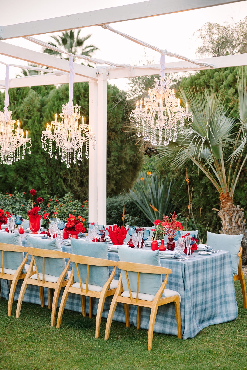
The reception’s playful colors were balanced by a distinctly refined tabletop.
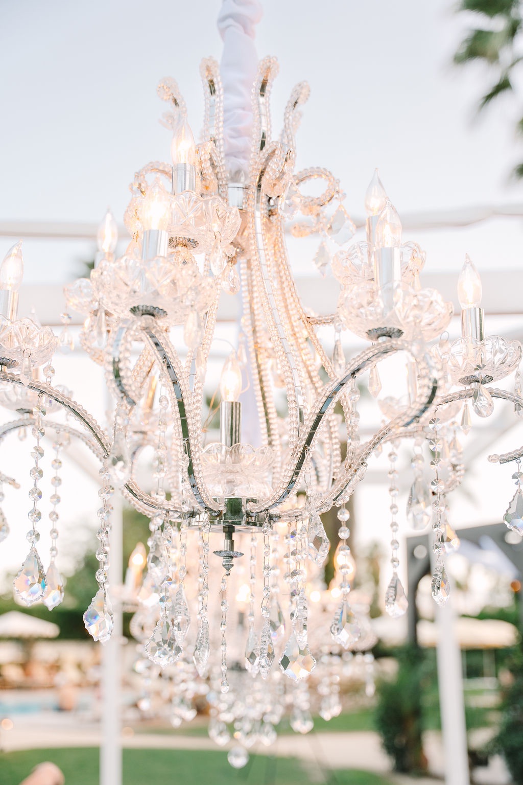
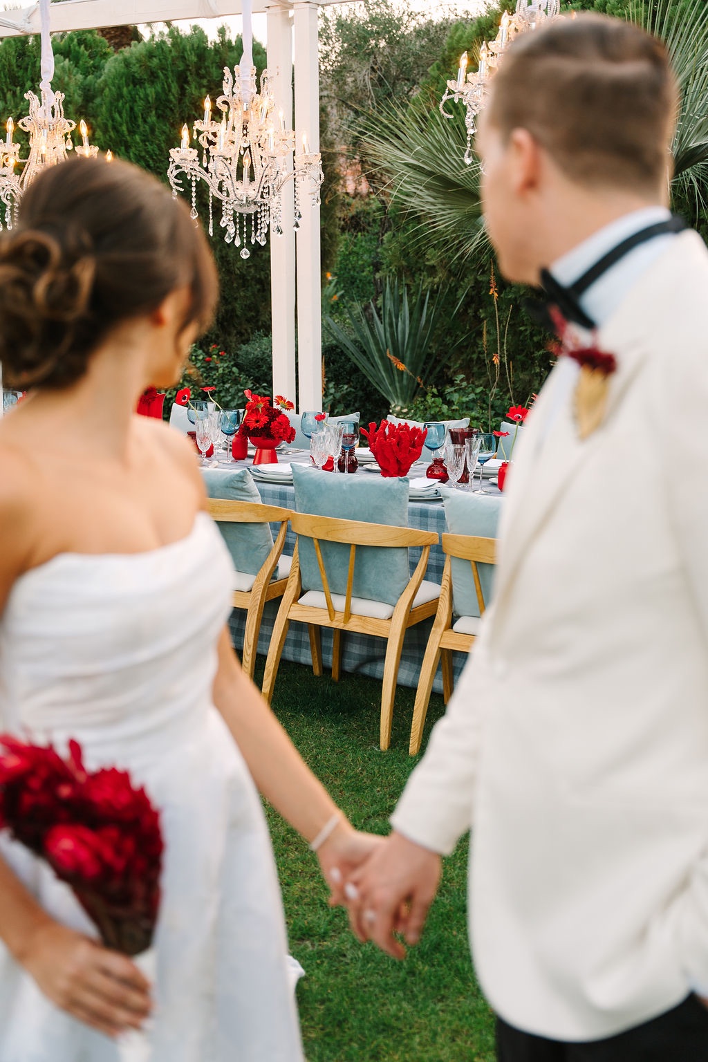
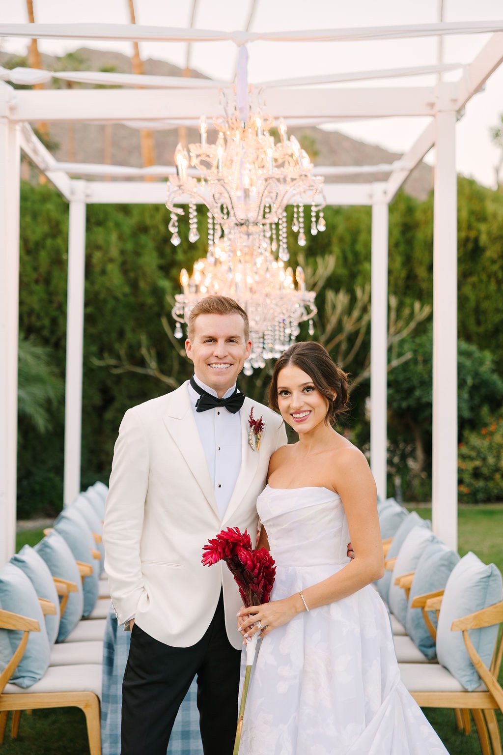
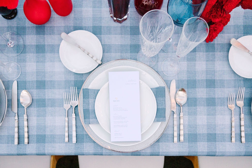
An all-silver palette brought shine and cohesion to the place settings, while chandeliers added another layer of elegance overhead. Paired with plaid linens and coral florals, the metallic details prevented the colorful design from becoming overly casual.
Silver also appeared earlier in the weekend through the champagne punch bowls, creating a subtle visual thread between the arrival experience and the reception.
A single pearl finished every menu
One of the smallest details ultimately gave the editorial its name.
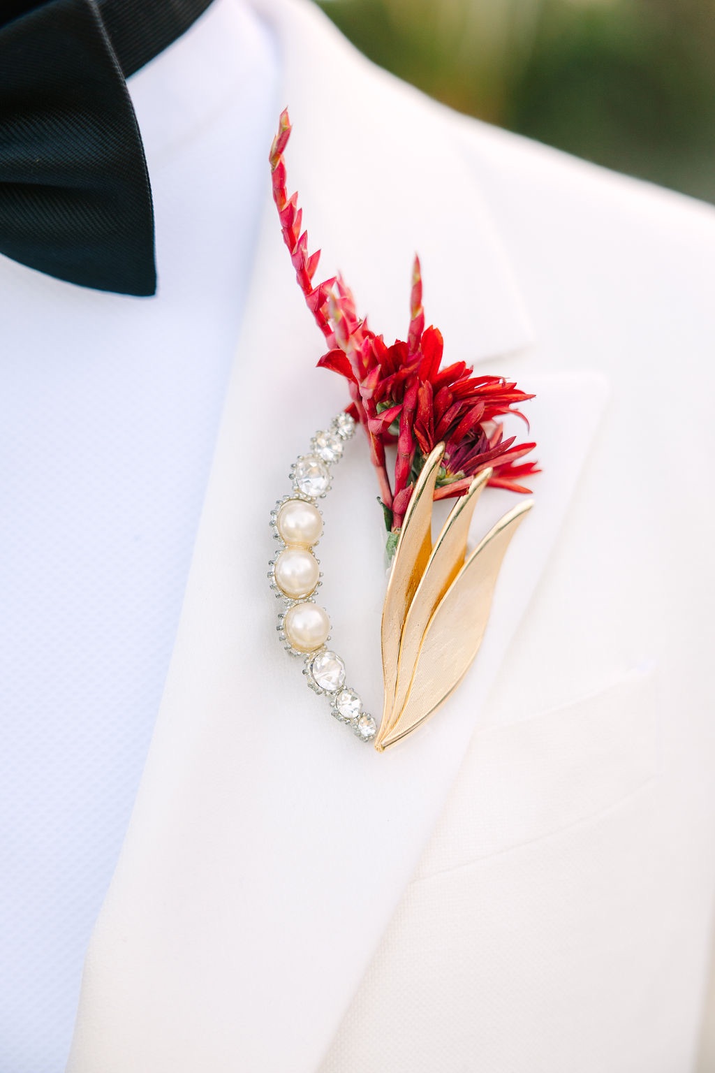
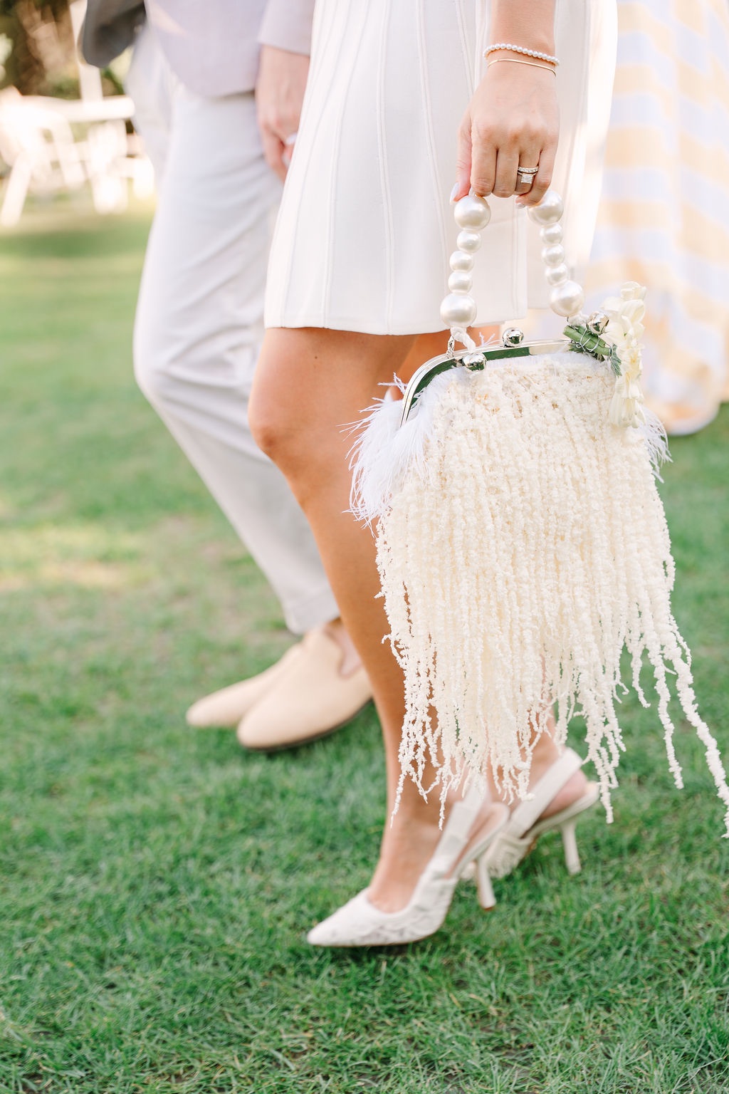
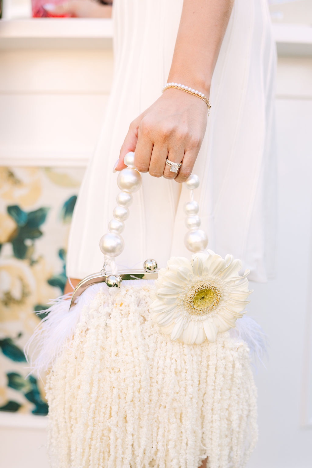
A single pearl was placed on each menu, quietly carrying the pearl motif into every place setting. Rather than using pearls as an overt theme, the design treated them as a finishing touch.
That restraint made the detail more effective. Against colorful flowers, patterned linens, and gleaming silver, one tiny pearl was enough to reinforce the polished, preppy influence behind the concept.
Plaid, Pearls and Palm Springs ultimately makes its strongest argument through contrast. Cape Cod tailoring meets California warmth. Plaid appears beside coral flowers. Oysters are served from coupe glasses while champagne fills silver punch bowls. Topiary spheres give way to colorful reception florals, and polished tabletop details coexist with playful poolside nostalgia.
None of those elements necessarily belong together on paper, which is precisely the point. Thoughtfully combined, the unexpected mix feels fresh rather than mismatched, proving that even something as traditionally seasonal as plaid can find an entirely new life beneath the Palm Springs sun.