Incorporating the Pantone Color of the Year into Your Wedding
Now that Pantone has officially revealed this year’s highly anticipated Color of the Year as ‘Very Peri’, it’s time to get creative with your color palette! As always, Pantone has attached a deeper meaning to this fun shade, noting that periwinkle is a symbol of emerging from a long period of isolation. Considering that most couples have had to postpone their celebratory day, it’s safe to say that this is quite fitting.
You may be wondering: how does one effortlessly incorporate such a bold color into a romantic wedding palette? Worry not – we’ve enlisted the help of wedding industry experts to share their insight on making this new trend your own.
Dissecting Very Peri
Let’s start by detailing what exactly Very Peri is before you begin compiling swatches. By nature, periwinkle is a blue-toned purple, which lends itself to being a much cooler color than traditional royal purple as we’ve seen in past weddings. This means that the palette can extend to complementary shades of red-violet and even blue, given that this hue is a mixture of both.
When it comes to utilizing Very Peri, it’s important to note that you have the creative freedom or either opting for a monotone, gradient look, or branching out to other pairings with periwinkle as the star of the show.
What the pros are saying
While another Pantone purple may not be everyone’s cup of tea, these pros had a lot of excitement about the selected COTY that could help you and your partner see the shade in a different light.
Renée Sabo of Urban Soirée is personally a big fan of the newly announced hue. She shares, “It feels tranquil and soft.” She continues that while it is a cool tone, it gave off an approachable feel that is sure to be embraced by couples.
Leah Weinberg of Color Pop Events, whose own branding coincidently includes a similar color, agrees adding, “I also think it's especially great that they created a brand-new color for this year, rather than picking an existing color.”
Megan Acosta of Glamour & Grace adds, “I think the big takeaway the industry can take from Pantone and this choice is to be creative. This year, instead of picking a color that was based on trends around the creative world, they created an entirely new color to start a trend. This should resonate with wedding pros that after the craziness of the past two years, 2022 is a time for fresh newness and creativity.”
Tips for tastefully including the shade
If you’re looking to stay on-trend and add pops of periwinkle into your upcoming wedding, look no further. There are plenty of ways in which to weave this muted purple into your big day, or even opt for something a little more subtle.
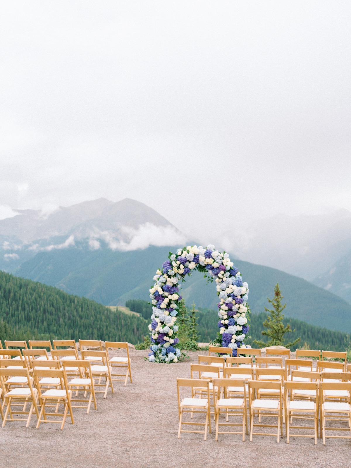
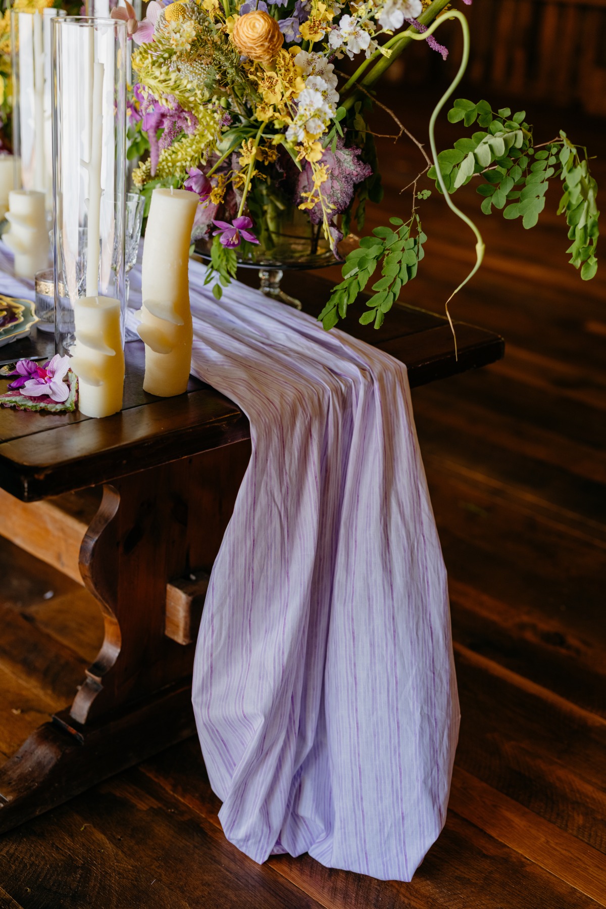
For instance, Weinberg suggests, “With a color like purple, there are some places where you should incorporate it sparingly and other places where it can be the focal point. While I don't necessarily suggest all-purple tablecloths at your celebration, consider bringing in pops with your napkins against a white linen. Going heavy on purple for your centerpieces could work as long as it’s not competing with patterns or other bold colors.”
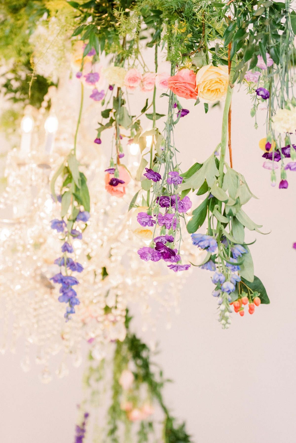
Joan Wyndrum of Blooms by the Box feels that one of the best ways to showcase this color is by using it in your bouquet. “Instead of going with classic colors, spring for shades of purple-y blue flowers such as ocean song roses, purple lisianthus, or misty blue limonium paired with your favorite white garden roses.”
The beauty of Very Peri, shares Sarah Blessinger of Kindred Weddings & Events is that it may very well work during any season, as long as you’ve selected the right color palette to accompany it. “Very Peri can be stand out when paired with neutrals, but it could also work well with jewel tones to create contract, or with pastels as a more cohesive blend.”
Acosta adds, “Since Very Peri is an entirely new color, it will be a tough one to find out in the wild, which is where being creative and going custom is going to be your best bet for including this hue in weddings this year and beyond. For spring, I love this periwinkle paired with lighter colors, like a soft sage or a French blue. In the fall, this hue looks great combined with jewel tones like burgundy or berry. Very Peri can very easily be incorporated into popular trends like Cottagecore and the regency revival thanks to shows like Bridgerton.”
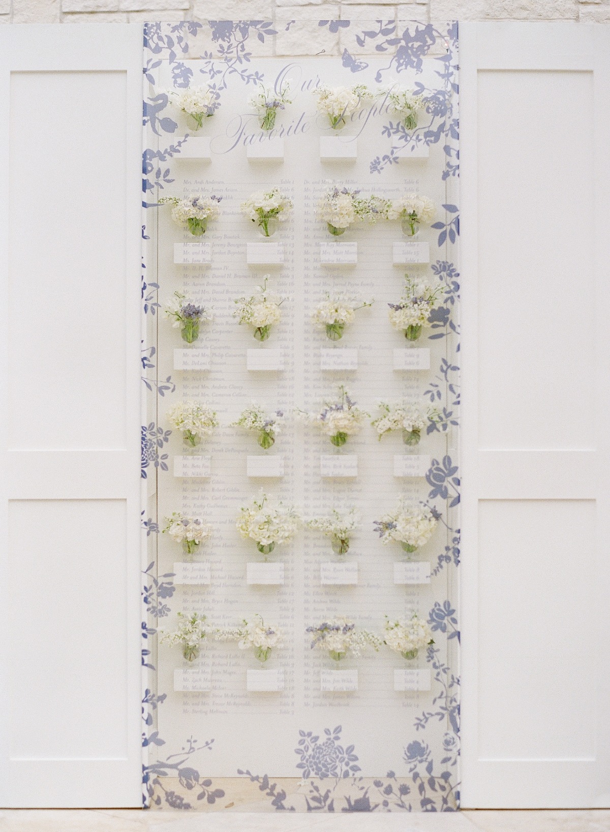
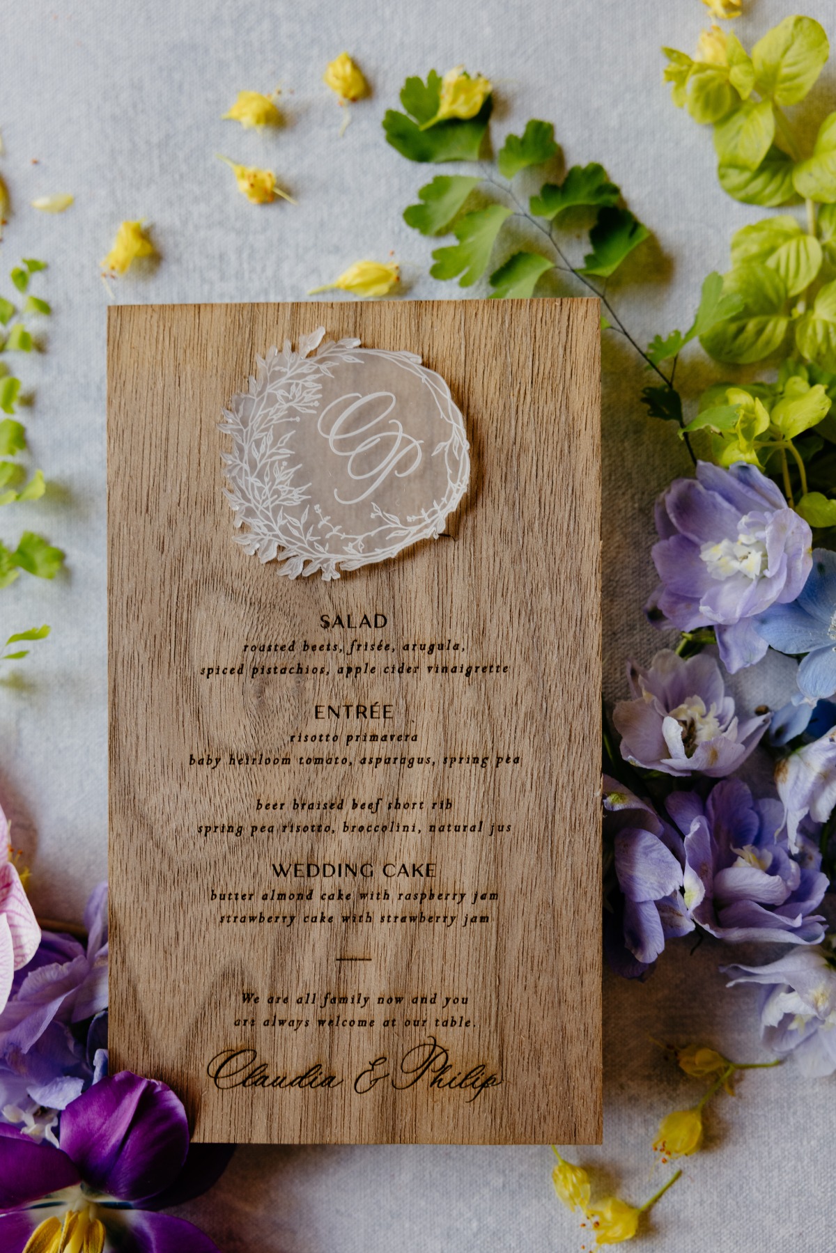
Lastly, Tonya Hoopes of Hoopes Events recommends utilizing the hue within your stationery items and wedding party attire for that ‘wow’ factor. “It could also be used as a color for your paper suites, including your escort cards, table numbers, and seating charts. Very Peri would be a beautiful color for your wedding party, along with cooler tones of navy blue, grey, or black. I would suggest not overusing it as the main color but as a color that has equal use with complementary colors or used as an accent color.”
The wonderful thing about Pantone’s Very Peri is its versatility. You can use it for a pop of color for a lasting impact, or spring for a chic theme such as coordinating soft hues or iridescent touches.
With that, Weinberg went on to say that she recognizes some people probably won't be too thrilled with this year's pick because purple can be a little intimidating. She continues, “I would still encourage folks to embrace it and get creative in incorporating this new color into their events!”
Ultimately, however you choose to use this trending shade, make sure that you and your partner have fun with it!
Meghan Ely is the owner of wedding PR and wedding marketing firm OFD Consulting. Ely is a sought-after speaker, adjunct professor in the field of public relations, and a self-professed royal wedding enthusiast.
- Event Planning & Design: Urban Soirée
- Event Planning & Design: Color Pop Events
- Event Planning & Design: Kindred Weddings & Events
- Event Planning & Design: Hoopes Events
- Flowers: Blooms by the Box
- Wedding Blog: Glamour & Grace
- Wedding Photographers: Amy Kolo
- Wedding Photographers: Brittany Lowe Photography
- Wedding Photographers: Julia Wade Photography
- Wedding Photographers: Cat Galletti
- Wedding Photographers: Kelly Hornberger Photography
- Wedding PR: Meghan Ely